Build your web apps using Smart UI
Smart.Window - configuration and usage
Overview
Smart.Window represents a custom element which acts as a draggable and resizable HTML container that sits ontop of the page.
Getting Started with Window Web Component
Smart UI for Web Components is distributed as smart-webcomponents NPM package. You can also get the full download from our website with all demos from the Download page.Setup the Window
Smart UI for Web Components is distributed as smart-webcomponents NPM package
- Download and install the package.
npm install smart-webcomponents
- Once installed, import the Window module in your application.
<script type="module" src="node_modules/smart-webcomponents/source/modules/smart.window.js"></script>
-
Adding CSS reference
The smart.default.css CSS file should be referenced using following code.
<link rel="stylesheet" type="text/css" href="node_modules/smart-webcomponents/source/styles/smart.default.css" />
- Add the Window tag to your Web Page
<smart-window id="window"></smart-window>
- Create the Window Component
	<script type="module">
		Smart('#window', class {
			get properties() {
				return { opened: true }
			}
		});
	</script>
Another option is to create the Window is by using the traditional Javascript way:
	const window = document.createElement('smart-window');

	window.disabled = true;
	document.body.appendChild(window);
Smart framework provides a way to dynamically create a web component on demand from a DIV tag which is used as a host. The following imports the web component's module and creates it on demand, when the document is ready. The #window is the ID of a DIV tag.
	import "../../source/modules/smart.window.js";

	document.readyState === 'complete' ? init() : window.onload = init;

	function init() {
		const window = new Smart.Window('#window', { opened: true });
	}
- Open the page in your web server.
The following code adds the custom element to the page.
<!DOCTYPE html>
<html>
<head>
 <link rel="stylesheet" href="../../source/styles/smart.default.css" type="text/css" />
 <script type="text/javascript" src="../../source/smart.element.js"></script>
 <script type="text/javascript" src="../../source/smart.button.js"></script>
 <script type="text/javascript" src="../../source/smart.window.js"></script>
</head>
<body>
 <smart-window opened></smart-window>
</body>
</html>
Demo
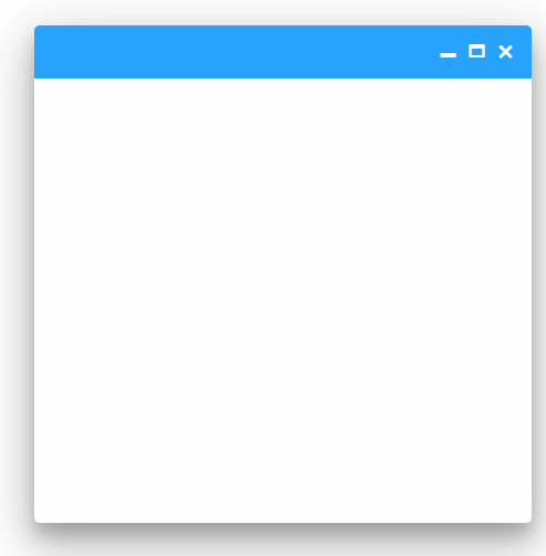
The opened attribue is applied in order to show the window element. By default the property is not applied and the window is not visible.
Appearance
Smart.Window element represents a blank HTML container that can be used as a window for other elements, a modal that prompts for something while blocking the UI in the background or just a simple prompt panel asking for user permission. The appearance of the window depends on user preferences.
The element can appear as closed or opened. Opened means the element is visible while closed means hidden. To open a window simply set the opened attribute or call the open() method:
<!DOCTYPE html>
<html>
<head>
 <link rel="stylesheet" href="../../source/styles/smart.default.css" type="text/css" />
 <script type="text/javascript" src="../../source/smart.element.js"></script>
 <script type="text/javascript" src="../../source/smart.button.js"></script>
 <script type="text/javascript" src="../../source/smart.window.js"></script>
 <script>
     window.onload = function () {
        document.querySelector('smart-window').open();
     }
 </script>
</head>
<body>
 <smart-window></smart-window>
</body>
</html>
Demo

To close the window simply remove the opened attribute or call the close() method.
The window element has three sections: header, content and footer. All three of them are completely customizable.
The Header usually holds a label that represents the name of the window:
<smart-window opened label="New Window"></smart-window>
Demo
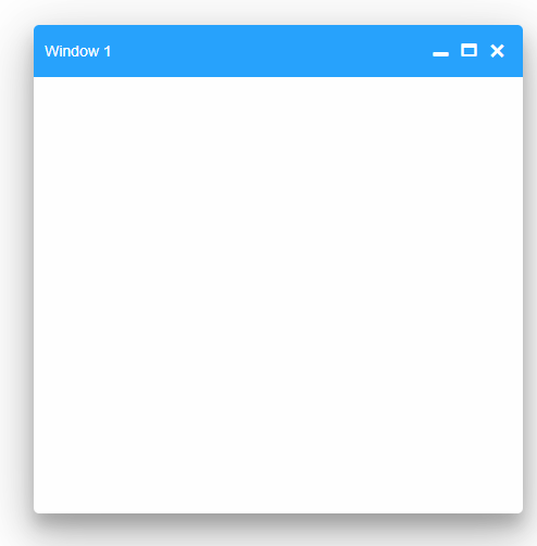
However the user can change the content of The Header to include any HTML code by passing an HTML Tempalte element to the headerTemplate property like so:
<!DOCTYPE html>
<html>
<head>
 <link rel="stylesheet" href="../../source/styles/smart.default.css" type="text/css" />
 <script type="text/javascript" src="../../source/smart.element.js"></script>
 <script type="text/javascript" src="../../source/smart.button.js"></script>
 <script type="text/javascript" src="../../source/smart.window.js"></script>
 <style>
     .glyphicon-cloud {
        margin-right: 5px;
     }
 </style>
</head>
<body>
 <template id="headerTemplate">
     <span class="glyphicon glyphicon-cloud"></span>
     <span>Window</span>
 </template>

 <smart-window opened header-template="headerTemplate"></smart-window>
</body>
</html>
Demo
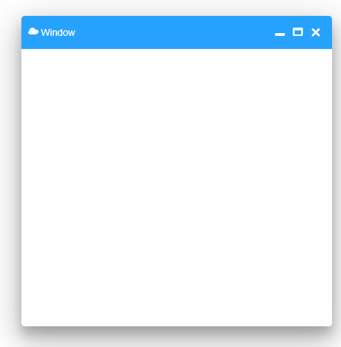
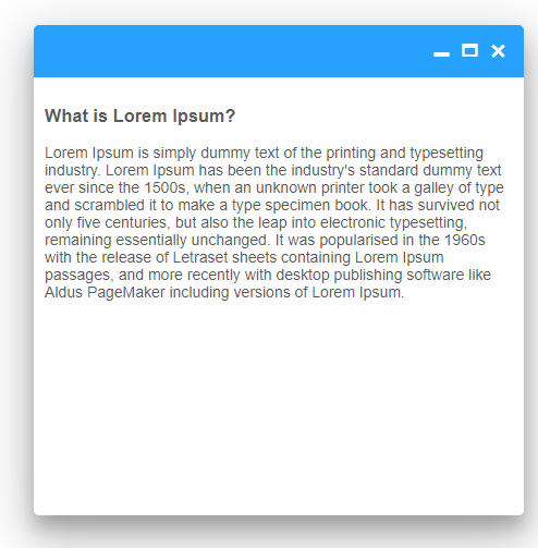
The Content section is the main section of the element. Here the user can store anything he desires in two ways:
-
Place any HTML content between the opening and closing breckets of the element in the initialization code, like so:
<smart-window opened>
 <section>
    <h3>What is Lorem Ipsum?</h3>
    <p>
        Lorem Ipsum is simply dummy text of the printing and typesetting industry. Lorem Ipsum has been the industry's standard dummy text ever since the 1500s, when an unknown printer took a galley of type and scrambled it to make a type specimen book. It has survived not only five centuries, but also the leap into electronic typesetting, remaining essentially unchanged. It was popularised in the 1960s with the release of Letraset sheets containing Lorem Ipsum passages, and more recently with desktop publishing software like Aldus PageMaker including versions of Lorem Ipsum.
     </p>
  </section>
 </smart-window>
Demo

-
Change the content of the window at any time ( after the element has been initialized and ready) using the innerHTML property:
<!DOCTYPE html>
<html>
<head>
 <link rel="stylesheet" href="../../source/styles/smart.default.css" type="text/css" />
 <script type="text/javascript" src="../../source/smart.element.js"></script>
 <script type="text/javascript" src="../../source/smart.button.js"></script>
 <script type="text/javascript" src="../../source/smart.window.js"></script>
 <script>
    window.onload = function () {
        document.querySelector('smart-window').innerHTML = `
        <section>
         <h2>What is Lorem Ipsum?</h2>
         <p>
         Lorem Ipsum is simply dummy text of the printing and typesetting industry. Lorem Ipsum has been the industry's standard dummy text ever since the 1500s, when an unknown printer took a galley of type and scrambled it to make a type specimen book. It has survived not only five centuries, but also the leap into electronic typesetting, remaining essentially unchanged. It was popularised in the 1960s with the release of Letraset sheets containing Lorem Ipsum passages, and more recently with desktop publishing software like Aldus PageMaker including versions of Lorem Ipsum.
         </p>
         </section>`;
        }
 </script>
</head>
<body>
 <smart-window opened></smart-window>
</body>
</html>
Notice how we apply the changes during the window.onload. This is the stage at which the custom elements are initialized and ready to accept changes.
Demo
The Footer section of the element can also be customized using HTML Template:
<!DOCTYPE html>
<html>
<head>
 <link rel="stylesheet" href="../../source/styles/smart.default.css" type="text/css" />
 <script type="text/javascript" src="../../source/smart.element.js"></script>
 <script type="text/javascript" src="../../source/smart.button.js"></script>
 <script type="text/javascript" src="../../source/smart.window.js"></script>
 <style>
     smart-window {
         --smart-window-header-height: 40px;
         --smart-window-footer-height: 40px;
         --smart-window-default-height: 200px;
     }

    smart-window .smart-footer {
        display: flex;
        justify-content: space-evenly;
     }

     smart-window .smart-footer smart-button {
        height: 100%;
     }
 </style>
</head>
<body>
 <template id="footerTemplate">
     <smart-button>No</smart-button>
     <smart-button>Yes</smart-button>
 </template>

 <smart-window opened footer-template="footerTemplate">
    <h2>Want to learn more?</h2>
</smart-window>
</body>
</html>
Demo
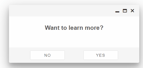
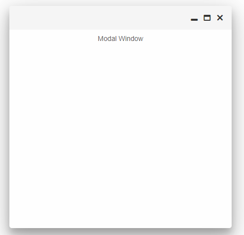
Modal Windows are used when the user wants to block the UI in the background. In order to enable that functionality of the element simply add the modal attribute to the HTML tag of the element:
<smart-window opened modal>Modal Window</smart-window>
Demo

Or set the modal property via Javascript:
<!DOCTYPE html>
<html>
<head>
 <link rel="stylesheet" href="../../source/styles/smart.default.css" type="text/css" />
 <script type="text/javascript" src="../../source/smart.element.js"></script>
 <script type="text/javascript" src="../../source/smart.button.js"></script>
 <script type="text/javascript" src="../../source/smart.window.js"></script>
 <script>
     window.onload = function () {
        document.querySelector('smart-window').modal = true;
     }
 </script>
</head>
<body>
 <smart-window opened>Modal Window</smart-window>
</body>
</html>
Demo
Behavior
Smart.Window can be dragged or resized inside the container of it's parent element. Dragging is enabled by default while resizing is not.
To enable resizing the user has to apply the property resizable to the element either in the HTML tag of the element or via javascript:
<smart-window opened resizable></smart-window>
Demo
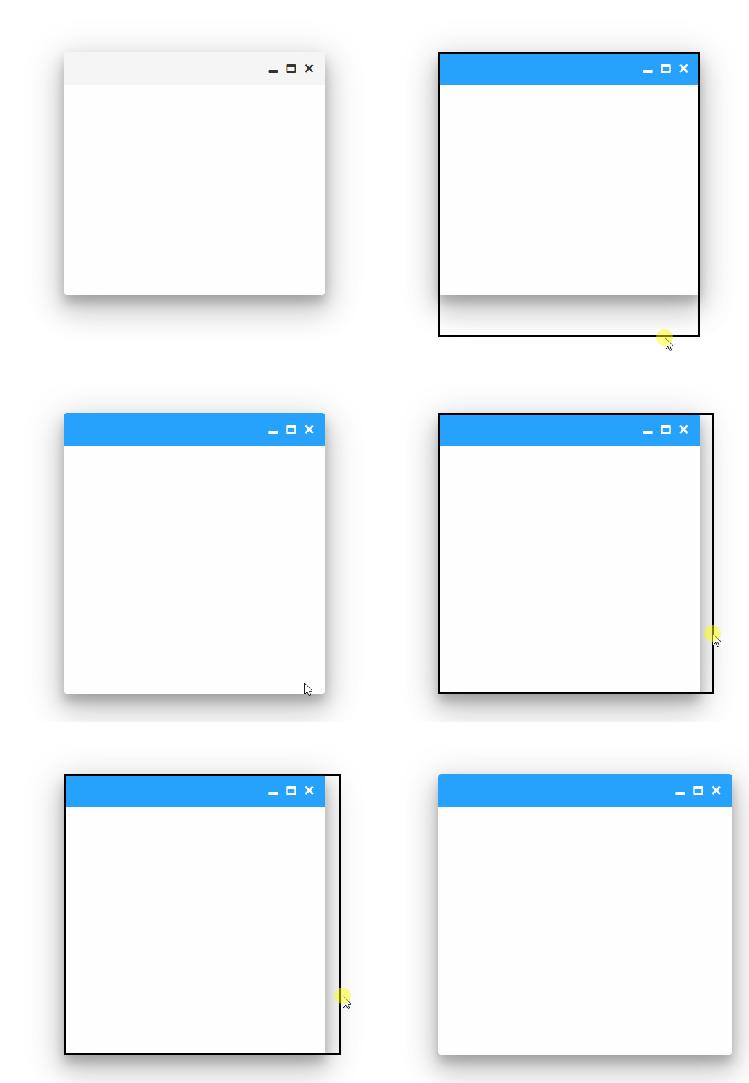
The window can be resized from any of it's sides or corners.
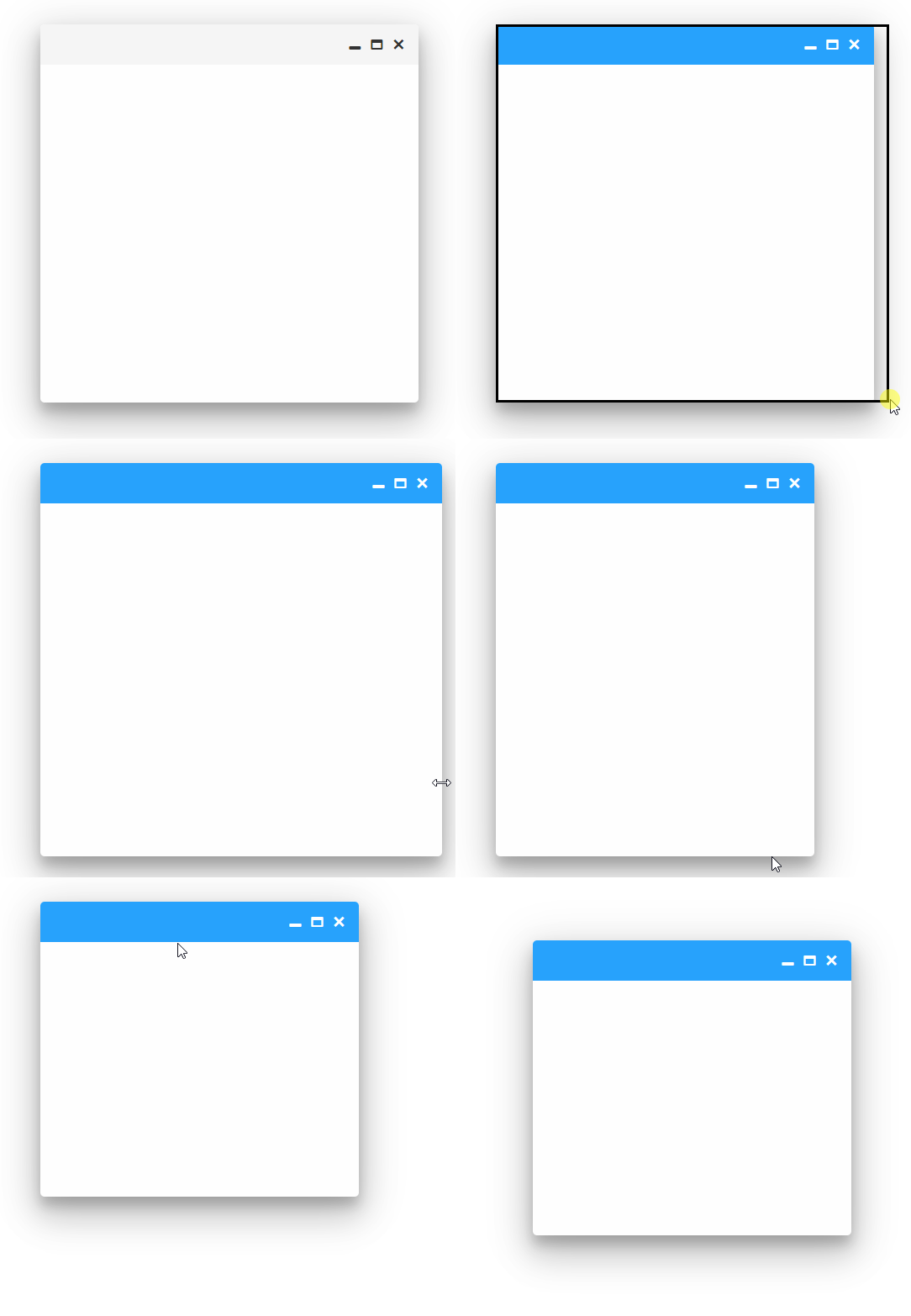
However there is a property that controls the resizing behavior called resizeMode.
Two modes are available:
- default - the window can be resized from any side or corner.
- corner - the window can be resized only from the bottom-right corner.
Changing the reseizeMode is as easy as the any other property:
<smart-window opened resizable resize-mode="corner"></smart-window>
Demo
Window dragging can be disabled by applying the pinned property:
<smart-window opened pinned></smart-window>
Demo
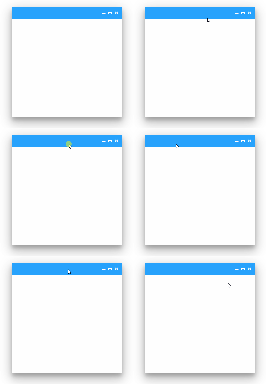
Or calling the pin() method:
<!DOCTYPE html>
<html>
<head>
 <link rel="stylesheet" href="../../source/styles/smart.default.css" type="text/css" />
 <script type="text/javascript" src="../../source/smart.element.js"></script>
 <script type="text/javascript" src="../../source/smart.button.js"></script>
 <script type="text/javascript" src="../../source/smart.window.js"></script>
 <script>
     window.onload = function () {
        document.querySelector('smart-window').pin();
     }
 </script>
</head>
<body>
 <smart-window opened></smart-window>
</body>
</html>
Demo

To allow dragging again simply remove the pinned attribute or call the unpin() method.
The window can fill the entire screen if necessary. This can be accomplished via the maximized property or by calling the maximize() method just like in the example above.
<smart-window maximized opened></smart-window>
Demo
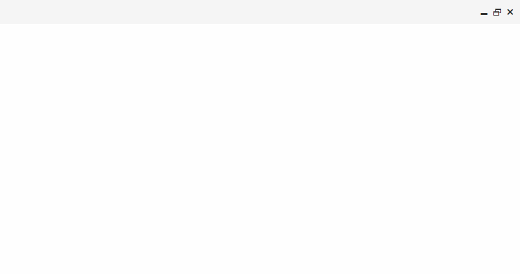
To restore the window size back to normal remove the maximized property or call the restore() method.
Smart.Window can be collapsed by applying the collapsed property or calling the collapse() method. When collapsed the only visible part of the window is the header section.
<smart-window collapsed opened></smart-window>
Demo

In order to restore the window to it's full size, remove the collapsed attribute or call the restore() method.
Keyboard Support
Smart.Window implements the following keys:
| Key | Action |
|---|---|
| Arrow Up / Arrow Down / Arrow Left/ Arrow Right | Move the window according to the direction. |
| Ctrl + Arrow Up / Arrow Down / Arrow Left/ Arrow Right | Resize the window according to the direction. |
| Alt + Arrow Up / Arrow Down | Maximize/Restore the window. |
| Ctrl + P | Pin/Unpin the window |
| Ctrl + C | Collapse/Uncollapse the window |
Styling
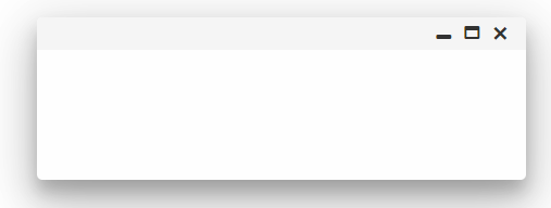
Smart.Window uses the following CSS variables for styling:
- --smart-window-default-height - sets the height of the element.
- --smart-widnow-default-width - sets the width of the element.
- --smart-window-header-height - sets the height of the header of the element.
- --smart-window-min-width - sets the min-width of the window element.
- --smart-window-footer-height - sets the height of the footer the element.
Here's how to apply the variables:
<!DOCTYPE html>
<html>
<head>
 <link rel="stylesheet" href="../../source/styles/smart.default.css" type="text/css" />
 <script type="text/javascript" src="../../source/smart.element.js"></script>
 <script type="text/javascript" src="../../source/smart.button.js"></script>
 <script type="text/javascript" src="../../source/smart.window.js"></script>
 <style>
     smart-window {
         --smart-window-default-height: 150px;
         --smart-widnow-default-width: 200px;
         --smart-window-header-height: 30px;
     }
 </style>
</head>
<body>
 <smart-window opened></smart-window>
</body>
</html>
Demo
Create, Append, Remove, Get/Set Property, Invoke Method, Bind to Event
Create a new element:
const window = document.createElement('smart-window');
Append it to the DOM:
document.body.appendChild(window);
Remove it from the DOM:
window.parentNode.removeChild(window);
Set a property:
window.propertyName = propertyValue;
Get a property value:
const propertyValue = window.propertyName;
Invoke a method:
window.methodName(argument1, argument2);
Add Event Listener:
	const eventHandler = (event) => {
	   // your code here.
	};

	window.addEventListener(eventName, eventHandler);
Remove Event Listener:
window.removeEventListener(eventName, eventHandler, true);
Using with Typescript
Smart Web Components package includes TypeScript definitions which enables strongly-typed access to the Smart UI Components and their configuration.
Inside the download package, the typescript directory contains .d.ts file for each web component and a smart.elements.d.ts typescript definitions file for all web components. Copy the typescript definitions file to your project and in your TypeScript file add a reference to smart.elements.d.ts
Read more about using Smart UI with Typescript.Getting Started with Angular Window Component
Setup Angular Environment
Angular provides the easiest way to set angular CLI projects using Angular CLI tool.
Install the CLI application globally to your machine.
npm install -g @angular/cli
Create a new Application
ng new smart-angular-window
Navigate to the created project folder
cd smart-angular-window
Setup the Window
Smart UI for Angular is distributed as smart-webcomponents-angular NPM package
- Download and install the package.
npm install smart-webcomponents-angular
- Adding CSS reference
The following CSS file is available in ../node_modules/smart-webcomponents-angular/ package folder. This can be referenced in [src/styles.css] using following code.@import 'smart-webcomponents-angular/source/styles/smart.default.css';
Another way to achieve the same is to edit the angular.json file and in the styles add the style."styles": [ "node_modules/smart-webcomponents-angular/source/styles/smart.default.css" ]
If you want to use Bootstrap, Fluent or other themes available in the package, you need to add them after 'smart.default.css'. -
Example with Angular Standalone Components
app.component.html
 <smart-button #button (onClick)="onButtonClick($event)" id="openButton">Open/Close</smart-button>
<smart-window #window [opened]="true" [label]="'Window 1'">
    <div id="article">
        <section>
             <h3>What is Lorem Ipsum?</h3>
            <p>Lorem Ipsum is simply dummy text of the printing and typesetting industry.
                Lorem Ipsum has been the industry's standard dummy text ever since the
                1500s, when an unknown printer took a galley of type and scrambled it to
                make a type specimen book. It has survived not only five centuries, but
                also the leap into electronic typesetting, remaining essentially unchanged.
                It was popularised in the 1960s with the release of Letraset sheets containing
                Lorem Ipsum passages, and more recently with desktop publishing software
                like Aldus PageMaker including versions of Lorem Ipsum.</p>
        </section>
        <section>
             <h3>Where does it come from?</h3>
            <p>Contrary to popular belief, Lorem Ipsum is not simply random text. It
                has roots in a piece of classical Latin literature from 45 BC, making it
                over 2000 years old. Richard McClintock, a Latin professor at Hampden-Sydney
                College in Virginia, looked up one of the more obscure Latin words, consectetur,
                from a Lorem Ipsum passage, and going through the cites of the word in
                classical literature, discovered the undoubtable source. Lorem Ipsum comes
                from sections 1.10.32 and 1.10.33 of "de Finibus Bonorum et Malorum" (The
                Extremes of Good and Evil) by Cicero, written in 45 BC. This book is a
                treatise on the theory of ethics, very popular during the Renaissance.
                The first line of Lorem Ipsum, "Lorem ipsum dolor sit amet..", comes from
                a line in section 1.10.32. The standard chunk of Lorem Ipsum used since
                the 1500s is reproduced below for those interested. Sections 1.10.32 and
                1.10.33 from "de Finibus Bonorum et Malorum" by Cicero are also reproduced
                in their exact original form, accompanied by English versions from the
                1914 translation by H. Rackham.</p>
        </section>
    </div>
</smart-window>
app.component.ts
 import { Component, ViewChild, OnInit, AfterViewInit, ViewEncapsulation } from '@angular/core';
import { ButtonComponent } from 'smart-webcomponents-angular/button';
import { WindowComponent } from 'smart-webcomponents-angular/window';


import { CommonModule } from '@angular/common';
import { RouterOutlet } from '@angular/router';
import { WindowModule } from 'smart-webcomponents-angular/window';

@Component({
    selector: 'app-root',
	standalone: true,
	imports: [CommonModule, WindowModule, RouterOutlet],
    templateUrl: './app.component.html',
	styleUrls: ['./app.component.css'],
	encapsulation: ViewEncapsulation.None
})

export class AppComponent implements AfterViewInit, OnInit {
	@ViewChild('button', { read: ButtonComponent, static: false }) button!: ButtonComponent;
	@ViewChild('window', { read: WindowComponent, static: false }) smartWindow!: WindowComponent;

	onButtonClick(event:any): void {
		const smartWindow = this.smartWindow;

		smartWindow.opened ? smartWindow.close() : smartWindow.open();
	}

	ngOnInit(): void {
		// onInit code.
	}

	ngAfterViewInit(): void {
		// afterViewInit code.
		this.init();
    }

	init(): void {
		// init code.

	}
}
-
Example with Angular NGModule
app.component.html
 <smart-button #button (onClick)="onButtonClick($event)" id="openButton">Open/Close</smart-button>
<smart-window #window [opened]="true" [label]="'Window 1'">
    <div id="article">
        <section>
             <h3>What is Lorem Ipsum?</h3>
            <p>Lorem Ipsum is simply dummy text of the printing and typesetting industry.
                Lorem Ipsum has been the industry's standard dummy text ever since the
                1500s, when an unknown printer took a galley of type and scrambled it to
                make a type specimen book. It has survived not only five centuries, but
                also the leap into electronic typesetting, remaining essentially unchanged.
                It was popularised in the 1960s with the release of Letraset sheets containing
                Lorem Ipsum passages, and more recently with desktop publishing software
                like Aldus PageMaker including versions of Lorem Ipsum.</p>
        </section>
        <section>
             <h3>Where does it come from?</h3>
            <p>Contrary to popular belief, Lorem Ipsum is not simply random text. It
                has roots in a piece of classical Latin literature from 45 BC, making it
                over 2000 years old. Richard McClintock, a Latin professor at Hampden-Sydney
                College in Virginia, looked up one of the more obscure Latin words, consectetur,
                from a Lorem Ipsum passage, and going through the cites of the word in
                classical literature, discovered the undoubtable source. Lorem Ipsum comes
                from sections 1.10.32 and 1.10.33 of "de Finibus Bonorum et Malorum" (The
                Extremes of Good and Evil) by Cicero, written in 45 BC. This book is a
                treatise on the theory of ethics, very popular during the Renaissance.
                The first line of Lorem Ipsum, "Lorem ipsum dolor sit amet..", comes from
                a line in section 1.10.32. The standard chunk of Lorem Ipsum used since
                the 1500s is reproduced below for those interested. Sections 1.10.32 and
                1.10.33 from "de Finibus Bonorum et Malorum" by Cicero are also reproduced
                in their exact original form, accompanied by English versions from the
                1914 translation by H. Rackham.</p>
        </section>
    </div>
</smart-window>
app.component.ts
 import { Component, ViewChild, OnInit, AfterViewInit, ViewEncapsulation } from '@angular/core';
import { ButtonComponent } from 'smart-webcomponents-angular/button';
import { WindowComponent } from 'smart-webcomponents-angular/window';


@Component({
    selector: 'app-root',
    templateUrl: './app.component.html',
	styleUrls: ['./app.component.css'],
	encapsulation: ViewEncapsulation.None
})

export class AppComponent implements AfterViewInit, OnInit {
	@ViewChild('button', { read: ButtonComponent, static: false }) button!: ButtonComponent;
	@ViewChild('window', { read: WindowComponent, static: false }) smartWindow!: WindowComponent;

	onButtonClick(event:any): void {
		const smartWindow = this.smartWindow;

		smartWindow.opened ? smartWindow.close() : smartWindow.open();
	}

	ngOnInit(): void {
		// onInit code.
	}

	ngAfterViewInit(): void {
		// afterViewInit code.
		this.init();
    }

	init(): void {
		// init code.

	}
}
app.module.ts
 import { NgModule } from '@angular/core';
import { BrowserModule } from '@angular/platform-browser';

import { ButtonModule } from 'smart-webcomponents-angular/button';
import { WindowModule } from 'smart-webcomponents-angular/window';

import { AppComponent } from './app.component';

@NgModule({
    declarations: [ AppComponent ],
    imports: [ BrowserModule, ButtonModule, WindowModule ],
    bootstrap: [ AppComponent ]
})

export class AppModule { }
Running the Angular application
After completing the steps required to render a Window, run the following command to display the output in your web browser
ng serveand open localhost:4200 in your favorite web browser.
Read more about using Smart UI for Angular: https://www.htmlelements.com/docs/angular-cli/.
Getting Started with React Window Component
Setup React Environment
The easiest way to start with React is to use NextJS Next.js is a full-stack React framework. It’s versatile and lets you create React apps of any size—from a mostly static blog to a complex dynamic application.
npx create-next-app my-app
cd my-app
npm run dev
or
yarn create next-app my-app
cd my-app
yarn run dev
Preparation
Setup the Window
Smart UI for React is distributed as smart-webcomponents-react package
- Download and install the package.
In your React Next.js project, run one of the following commands to install Smart UI Window for ReactWith NPM:
npm install smart-webcomponents-react
With Yarn:yarn add smart-webcomponents-react
- Once installed, import the React Window Component and CSS files in your application and render it.
app.js
import 'smart-webcomponents-react/source/styles/smart.default.css';
import React,  { useState, useRef, useEffect } from "react";
import ReactDOM from 'react-dom/client';
import { Window } from 'smart-webcomponents-react/window';
import { Button } from 'smart-webcomponents-react/button';
export default function App() {
    const testalert = () => {
        alert("Hello");
    }

	  const buttonInput = useRef(null);
	  useEffect(() => {
    // Update the document title using the browser API
		buttonInput.current.onclick = testalert;
  });

return (
                <Window windowParent='body' opened label="Window 1">
                    <Button onClick={testalert}>jQWidgets button</Button>
                    <button ref={buttonInput}
                        type="button"
                        onClick={

                            testalert

                        }
                    >
                        <span>Html Button</span>
                    </button>
                </Window>
  )
};
Running the React application
Start the app withnpm run devor
yarn run devand open localhost:3000 in your favorite web browser to see the output.
Setup with Vite
Vite (French word for "quick", pronounced /vit/, like "veet") is a build tool that aims to provide a faster and leaner development experience for modern web projectsWith NPM:
npm create vite@latestWith Yarn:
yarn create viteThen follow the prompts and choose React as a project.
Navigate to your project's directory. By default it is 'vite-project' and install Smart UI for React
In your Vite project, run one of the following commands to install Smart UI Window for ReactWith NPM:
npm install smart-webcomponents-reactWith Yarn:
yarn add smart-webcomponents-reactOpen src/App.tsx App.tsx
import 'smart-webcomponents-react/source/styles/smart.default.css';
import React,  { useState, useRef, useEffect } from "react";
import ReactDOM from 'react-dom/client';
import { Window } from 'smart-webcomponents-react/window';
import { Button } from 'smart-webcomponents-react/button';
export default function App() {
    const testalert = () => {
        alert("Hello");
    }

	  const buttonInput = useRef(null);
	  useEffect(() => {
    // Update the document title using the browser API
		buttonInput.current.onclick = testalert;
  });

return (
                <Window windowParent='body' opened label="Window 1">
                    <Button onClick={testalert}>jQWidgets button</Button>
                    <button ref={buttonInput}
                        type="button"
                        onClick={

                            testalert

                        }
                    >
                        <span>Html Button</span>
                    </button>
                </Window>
  )
};
Read more about using Smart UI for React: https://www.htmlelements.com/docs/react/.
Getting Started with Vue Window Component
Setup Vue with Vite
In this section we will introduce how to scaffold a Vue Single Page Application on your local machine. The created project will be using a build setup based on Vite and allow us to use Vue Single-File Components (SFCs). Run the following command in your command linenpm create vue@latestThis command will install and execute create-vue, the official Vue project scaffolding tool. You will be presented with prompts for several optional features such as TypeScript and testing support:
✔ Project name: …If you are unsure about an option, simply choose No by hitting enter for now. Once the project is created, follow the instructions to install dependencies and start the dev server:✔ Add TypeScript? … No / Yes ✔ Add JSX Support? … No / Yes ✔ Add Vue Router for Single Page Application development? … No / Yes ✔ Add Pinia for state management? … No / Yes ✔ Add Vitest for Unit testing? … No / Yes ✔ Add an End-to-End Testing Solution? … No / Cypress / Playwright ✔ Add ESLint for code quality? … No / Yes ✔ Add Prettier for code formatting? … No / Yes Scaffolding project in ./ ... Done.
cdnpm install npm install smart-webcomponents npm run dev
-
Make Vue ignore custom elements defined outside of Vue (e.g., using the Web Components APIs). Otherwise, it will throw a warning about an Unknown custom element, assuming that you forgot to register a global component or misspelled a component name.
Open vite.config.js in your favorite text editor and change its contents to the following:
vite.config.js
import { fileURLToPath, URL } from 'node:url' import { defineConfig } from 'vite' import vue from '@vitejs/plugin-vue' // https://vitejs.dev/config/ export default defineConfig({ plugins: [ vue({ template: { compilerOptions: { isCustomElement: tag => tag.startsWith('smart-') } } }) ], resolve: { alias: { '@': fileURLToPath(new URL('./src', import.meta.url)) } } }) -
Open src/App.vue in your favorite text editor and change its contents to the following:
App.vue
<template>
  <div class="vue-root">
    <smart-button id="openButton">Open/Close</smart-button>
    <smart-window opened label="Window 1">
      <div id="article">
        <section>
          <h3>What is Lorem Ipsum?</h3>
          <p>
            Lorem Ipsum is simply dummy text of the printing and typesetting industry.
            Lorem Ipsum has been the industry's standard dummy text ever since the
            1500s, when an unknown printer took a galley of type and scrambled it to
            make a type specimen book. It has survived not only five centuries, but
            also the leap into electronic typesetting, remaining essentially unchanged.
            It was popularised in the 1960s with the release of Letraset sheets containing
            Lorem Ipsum passages, and more recently with desktop publishing software
            like Aldus PageMaker including versions of Lorem Ipsum.
          </p>
        </section>
        <section>
          <h3>Where does it come from?</h3>
          <p>
            Contrary to popular belief, Lorem Ipsum is not simply random text. It
            has roots in a piece of classical Latin literature from 45 BC, making it
            over 2000 years old. Richard McClintock, a Latin professor at Hampden-Sydney
            College in Virginia, looked up one of the more obscure Latin words, consectetur,
            from a Lorem Ipsum passage, and going through the cites of the word in
            classical literature, discovered the undoubtable source. Lorem Ipsum comes
            from sections 1.10.32 and 1.10.33 of "de Finibus Bonorum et Malorum" (The
            Extremes of Good and Evil) by Cicero, written in 45 BC. This book is a
            treatise on the theory of ethics, very popular during the Renaissance.
            The first line of Lorem Ipsum, "Lorem ipsum dolor sit amet..", comes from
            a line in section 1.10.32. The standard chunk of Lorem Ipsum used since
            the 1500s is reproduced below for those interested. Sections 1.10.32 and
            1.10.33 from "de Finibus Bonorum et Malorum" by Cicero are also reproduced
            in their exact original form, accompanied by English versions from the
            1914 translation by H. Rackham.
          </p>
        </section>
      </div>
    </smart-window>
  </div>
</template>

<script>
import { onMounted } from "vue";
import "smart-webcomponents/source/styles/smart.default.css";
import "smart-webcomponents/source/modules/smart.button.js";
import "smart-webcomponents/source/modules/smart.window.js";

export default {
  name: "app",
  setup() {
    onMounted(() => {
      const smartWindow = document.querySelector("smart-window");
      document
        .getElementById("openButton")
        .addEventListener("click", function() {
          smartWindow.opened ? smartWindow.close() : smartWindow.open();
        });
    });
  }
};
</script>

<style>
html,
body,
#app,
.vue-root {
  width: 99%;
  height: 99%;
}

.smart-window #article {
  overflow: auto;
}

@media screen and (max-width: 700px) {
  .smart-window {
    width: 90% !important;
    left: 5% !important;
    top: 5px !important;
  }
}
</style>
We can now use the smart-window with Vue 3. Data binding and event handlers will just work right out of the box.
Running the Vue application
Start the app withnpm run devand open http://localhost:5173/ in your favorite web browser to see the output below:
When you are ready to ship your app to production, run the following:
npm run buildThis will create a production-ready build of your app in the project's ./dist directory.
Read more about using Smart UI for Vue: https://www.htmlelements.com/docs/vue/.