React & Smart UI
React provides a declarative library that keeps the DOM in sync with your data. This page explains how to use Smart UI Grid with React.
Overview
We will walk you through the steps to add Smart UI to an existing React project, and configure some of the features. Smart UI contains 60+ Components with Material Design. Some of the web components are: Grid, Chart, Gannt Chart, Docking Layout. For the purposes of the demo, we will use the Grid component. We will show you some of the data grid capabilities (properties, data source). In addition, we will customize the Grid appearance with custom Column Templates.
Smart.Grid
The Smart UI Grid component is a DataGrid(Table) component. The Grid supports loading of large amounts of data, scrolling, paging, load-on-demand, tree list rendering, spreadsheet rendering, keyboard navigation, CRUD, sort by one or many columns, filtering with filter menu, filter row or filter toolbar, data grouping with summaries with several rendering modes, editing by cell, row, dialog, command columns. Batch Editing, built-in Validation for fields. Built-in security with customizable HTML Tags Escape. You can choose whether to escape all html tags or a black list of tags like: 'script', 'object', etc. The grid comes with many available styling options, Material UI & Bootstrap themes which allow you to quickly build eye-catching, high-performance web apps.
It is the most feature-complete Grid component available on the market.
The Smart.Grid component for React has built-in data binding capabilities and supports Client and server-side model. It can be bound to Local Data, JSON, XML, CSV, TSV, Remote Data (JSONP) and Virtual Data where data is loaded on demand. In order to bind the Grid to a data source you need to set its source property to point to an instance of Smart.DataAdapter and configure the adapter as demonstrated in our docs & examples.
You can read more about Smart.Grid here. For React Grid demos, visit: Grid demos.
Table of Contents
Add "smart-grid" to Your React Project
We will use the 'create-react-app' react application as a starting point.
Getting Started with React Grid Component
Setup React Environment
The easiest way to start with React is to use create-react-app. To scaffold your project structure, follow the installation instructions.
npx create-react-app my-app
cd my-app
npm start
Preparation
Open src/App.js andsrc/App.css
- Remove everything inside the App div tag in src/App.js:
<div className="App"> </div>
- Remove the logo.svg import
- Remove the contents of src/App.css
- Remove src/logo.svg
Setup the Grid
Smart UI for React is distributed as smart-webcomponents-react NPM package
- Download and install the package.
npm install smart-webcomponents-react
Once installed, import the React Grid Component and CSS files in your application and render it
Open src/App.js in your favorite text editor and change its contents to the following:
App.js
import 'smart-webcomponents-react/source/styles/smart.default.css';
import React from "react";
import { Grid } from 'smart-webcomponents-react/grid';

const App = () => {
	const dataSource = [
		  { "firstName": "Beate", "lastName": "Wilson", "productName": "Caramel Latte"},
		  { "firstName": "Ian", "lastName": "Nodier", "productName": "Caramel Latte"},
		  { "firstName": "Petra", "lastName": "Vileid", "productName": "Green Tea"},
		  { "firstName": "Mayumi", "lastName": "Ohno", "productName": "Caramel Latte"},
		  { "firstName": "Mayumi", "lastName": "Saylor", "productName": "Espresso con Panna"},
		  { "firstName": "Regina", "lastName": "Fuller", "productName": "Caffe Americano" },
		  { "firstName": "Regina", "lastName": "Burke", "productName": "Caramel Latte"},
		  { "firstName": "Andrew", "lastName": "Petersen", "productName": "Caffe Americano"},
		  { "firstName": "Martin", "lastName": "Ohno", "productName": "Espresso con Panna"},
		  { "firstName": "Beate", "lastName": "Devling", "productName": "Green Tea"},
		  { "firstName": "Sven", "lastName": "Devling", "productName": "Espresso Truffle"},
		  { "firstName": "Petra", "lastName": "Burke", "productName": "Peppermint Mocha Twist"},
		  { "firstName": "Marco", "lastName": "Johnes", "productName": "Caffe Mocha"}
	]

	const columns = [{
		label: 'First Name',
		dataField: 'firstName'
	},
	{
		label: 'Last Name',
		dataField: 'lastName'
	},
	{
		label: 'Product',
		dataField: 'productName'
	}
	]

	return (
		<div>
			<Grid
				dataSource={dataSource}
				columns={columns}
				>
			</Grid>
		</div>
	);
}

export default App;
We can now use the smart-grid with React. Data binding and event handlers will just work right out of the box.
We have bound the "columns" and "dataSource" properties of the smart-grid to values in our React component.
Add Sorting and Filtering
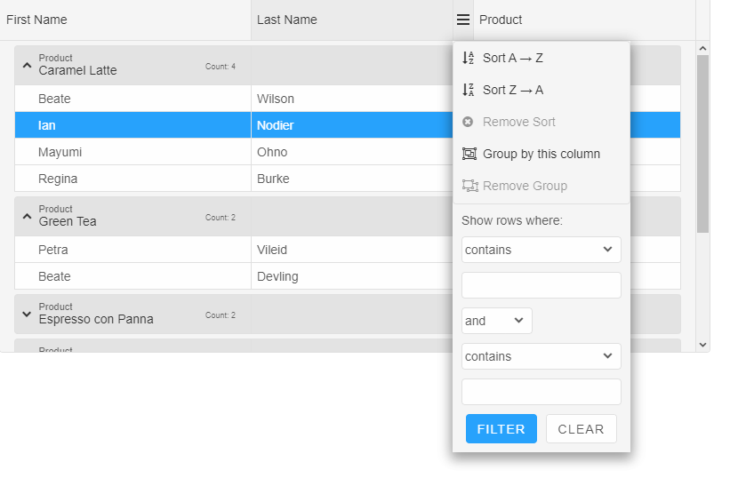
Sorting and Filtering are essential features in each web application with Grids. To enable the sorting and filtering in our grid, we need to define two objects - sorting and filtering and set the "enabled" boolean property to true. We add the below code to the Smart function defined in the App.js
import React from "react";
import ReactDOM from "react-dom";
import 'smart-webcomponents-react/source/styles/smart.default.css';
import { Grid } from 'smart-webcomponents-react/grid';

class App extends React.Component {
	behavior = {
		columnResizeMode: 'growAndShrink'
	}

	appearance = {
		alternationCount: 2,
		showRowHeader: true,
		showRowHeaderSelectIcon: true,
		showRowHeaderFocusIcon: true
	}

	paging = {
		enabled: true
	}

	pager = {
		visible: true
	}

	sorting = {
		enabled: true
	}

	editing = {
		enabled: true
	}

	filtering = {
		enabled: true
	}

	dataSource = [
		  { "firstName": "Beate", "lastName": "Wilson", "productName": "Caramel Latte"},
		  { "firstName": "Ian", "lastName": "Nodier", "productName": "Caramel Latte"},
		  { "firstName": "Petra", "lastName": "Vileid", "productName": "Green Tea"},
		  { "firstName": "Mayumi", "lastName": "Ohno", "productName": "Caramel Latte"},
		  { "firstName": "Mayumi", "lastName": "Saylor", "productName": "Espresso con Panna"},
		  { "firstName": "Regina", "lastName": "Fuller", "productName": "Caffe Americano" },
		  { "firstName": "Regina", "lastName": "Burke", "productName": "Caramel Latte"},
		  { "firstName": "Andrew", "lastName": "Petersen", "productName": "Caffe Americano"},
		  { "firstName": "Martin", "lastName": "Ohno", "productName": "Espresso con Panna"},
		  { "firstName": "Beate", "lastName": "Devling", "productName": "Green Tea"},
		  { "firstName": "Sven", "lastName": "Devling", "productName": "Espresso Truffle"},
		  { "firstName": "Petra", "lastName": "Burke", "productName": "Peppermint Mocha Twist"},
		  { "firstName": "Marco", "lastName": "Johnes", "productName": "Caffe Mocha"}
	]

	columns = [{
		label: 'First Name',
		dataField: 'firstName'
	},
	{
		label: 'Last Name',
		dataField: 'lastName'
	},
	{
		label: 'Product',
		dataField: 'productName'
	}
	]

	componentDidMount() {

	}

	render() {
		return (
			<div>
				<Grid
					dataSource={this.dataSource}
					columns={this.columns}
					appearance={this.appearance}
					behavior={this.behavior}
					paging={this.paging}
					pager={this.pager}
					filtering={this.filtering}
					sorting={this.sorting}
					editing={this.editing}
					>
				</Grid>
			</div>
		);
	}
}

export default App;

Enable Selection
The Grid supports selection by cell, row and with checkboxes. We can also choose from selection with single and double-click, selection by one or multiple rows or cells. In the code below, we will enable the Row selection. We add the below code to the Smart funtion App.js
	selection = {
		enabled: true
	}
Add Grouping
Similar to Sorting and Filtering, Grouping is enabled by setting the "enabled" property to true
We add the below code to App.js
	grouping = {
		enabled: true
	}
App.js
import React from "react";
import ReactDOM from "react-dom";
import 'smart-webcomponents-react/source/styles/smart.default.css';
import { Grid } from 'smart-webcomponents-react/grid';

class App extends React.Component {
	behavior = {
		columnResizeMode: 'growAndShrink'
	}

	appearance = {
		alternationCount: 2,
		showRowHeader: true,
		showRowHeaderSelectIcon: true,
		showRowHeaderFocusIcon: true
	}

	grouping = {
		enabled: true
	}

	sorting = {
		enabled: true
	}

	editing = {
		enabled: true
	}

	dataSource = [
		  { "firstName": "Beate", "lastName": "Wilson", "productName": "Caramel Latte"},
		  { "firstName": "Ian", "lastName": "Nodier", "productName": "Caramel Latte"},
		  { "firstName": "Petra", "lastName": "Vileid", "productName": "Green Tea"},
		  { "firstName": "Mayumi", "lastName": "Ohno", "productName": "Caramel Latte"},
		  { "firstName": "Mayumi", "lastName": "Saylor", "productName": "Espresso con Panna"},
		  { "firstName": "Regina", "lastName": "Fuller", "productName": "Caffe Americano" },
		  { "firstName": "Regina", "lastName": "Burke", "productName": "Caramel Latte"},
		  { "firstName": "Andrew", "lastName": "Petersen", "productName": "Caffe Americano"},
		  { "firstName": "Martin", "lastName": "Ohno", "productName": "Espresso con Panna"},
		  { "firstName": "Beate", "lastName": "Devling", "productName": "Green Tea"},
		  { "firstName": "Sven", "lastName": "Devling", "productName": "Espresso Truffle"},
		  { "firstName": "Petra", "lastName": "Burke", "productName": "Peppermint Mocha Twist"},
		  { "firstName": "Marco", "lastName": "Johnes", "productName": "Caffe Mocha"}
	]

	columns = [{
		label: 'First Name',
		dataField: 'firstName'
	},
	{
		label: 'Last Name',
		dataField: 'lastName'
	},
	{
		label: 'Product',
		dataField: 'productName'
	}
	]

	componentDidMount() {

	}

	render() {
		return (
			<div>
				<Grid
					dataSource={this.dataSource}
					columns={this.columns}
					appearance={this.appearance}
					behavior={this.behavior}
					grouping={this.grouping}
					sorting={this.sorting}
					>
				</Grid>
			</div>
		);
	}
}

export default App;

Enable Editing
smart-grid supports editing by cell, editing by row and editing with dialog or command column. In this case, we will use the cell editing. You can enable the editing functionality by setting the "enabled" boolean property to true.
App.js
	editing = {
		enabled: true
	}

		render() {
		return (
			<div>
				<Grid
					dataSource={this.dataSource}
					columns={this.columns}
					appearance={this.appearance}
					behavior={this.behavior}
					grouping={this.grouping}
					sorting={this.sorting}
					editing={this.editing}
					>
				</Grid>
			</div>
		);
	}
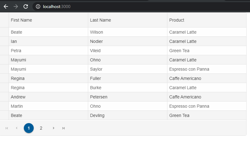
Enable Paging
To enable pagination, set the grid paging and pager properties. The paging.enabled turns on/off pagination, pager.visible shows/hides the top or bottom pagers. The grid's pagination feature can be used to load data on demand. It can be used with all other grid features. There are built-in options to customize the "pageSize", navigate through pages using API, customize the pager's template, configure whether top and bottom pagers are visible all the time or only the top or bottom pager is visible. It is also optional to display a "select" tag to dynamically update the page size or an "input" tag which allows you to type the page index and navigate to the page.
App.js
import React from "react";
import ReactDOM from "react-dom";
import 'smart-webcomponents-react/source/styles/smart.default.css';
import { Grid } from 'smart-webcomponents-react/grid';

class App extends React.Component {
	behavior = {
		columnResizeMode: 'growAndShrink'
	}

	appearance = {
		alternationCount: 2,
		showRowHeader: true,
		showRowHeaderSelectIcon: true,
		showRowHeaderFocusIcon: true
	}

	paging = {
		enabled: true
	}

	pager = {
		visible: true
	}

	sorting = {
		enabled: true
	}

	editing = {
		enabled: true
	}

	filtering = {
		enabled: true
	}

	dataSource = [
		  { "firstName": "Beate", "lastName": "Wilson", "productName": "Caramel Latte"},
		  { "firstName": "Ian", "lastName": "Nodier", "productName": "Caramel Latte"},
		  { "firstName": "Petra", "lastName": "Vileid", "productName": "Green Tea"},
		  { "firstName": "Mayumi", "lastName": "Ohno", "productName": "Caramel Latte"},
		  { "firstName": "Mayumi", "lastName": "Saylor", "productName": "Espresso con Panna"},
		  { "firstName": "Regina", "lastName": "Fuller", "productName": "Caffe Americano" },
		  { "firstName": "Regina", "lastName": "Burke", "productName": "Caramel Latte"},
		  { "firstName": "Andrew", "lastName": "Petersen", "productName": "Caffe Americano"},
		  { "firstName": "Martin", "lastName": "Ohno", "productName": "Espresso con Panna"},
		  { "firstName": "Beate", "lastName": "Devling", "productName": "Green Tea"},
		  { "firstName": "Sven", "lastName": "Devling", "productName": "Espresso Truffle"},
		  { "firstName": "Petra", "lastName": "Burke", "productName": "Peppermint Mocha Twist"},
		  { "firstName": "Marco", "lastName": "Johnes", "productName": "Caffe Mocha"}
	]

	columns = [{
		label: 'First Name',
		dataField: 'firstName'
	},
	{
		label: 'Last Name',
		dataField: 'lastName'
	},
	{
		label: 'Product',
		dataField: 'productName'
	}
	]

	componentDidMount() {

	}

	render() {
		return (
			<div>
				<Grid
					dataSource={this.dataSource}
					columns={this.columns}
					appearance={this.appearance}
					behavior={this.behavior}
					paging={this.paging}
					pager={this.pager}
					filtering={this.filtering}
					sorting={this.sorting}
					editing={this.editing}
					>
				</Grid>
			</div>
		);
	}
}

export default App;
Set Theme
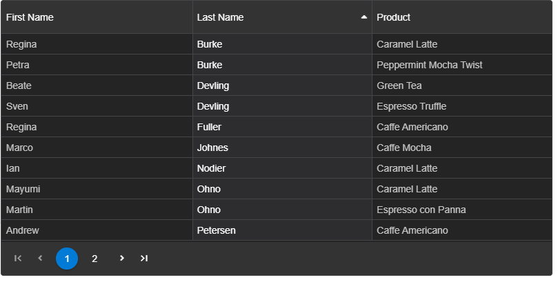
The Smart Web Components product includes 14 Material Themes - 7 Light and 7 Dark. To set a theme, just include the "smart.[theme].css" file after smart.default.css and set your component's theme attribute to the theme name.

If you would like to customize or build a custom theme, you can use our Online Theme Builder web application.
Summary
You just learned how to setup an React project and add a Grid Web Component with Sorting, Filtering, Grouping and Selection.