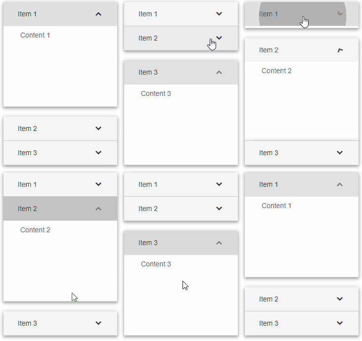
Getting Started with Smart UI
Depending on your preferences and the requirements of your project, you can:
- Download the Open-Source Licensed Smart UI Community version.
- Download the Commercial version of Smart UI for a Trial Period.
- Get your Commercial License for Smart UI Professional.
- Install through NPM
- npm i smart-webcomponents - Javascript Web Components package
- npm i smart-webcomponents-community - Javascript Web Components and Custom elements Community(FREE) package
- npm i smart-webcomponents-angular - Angular package
- npm i smart-webcomponents-react - React package
| FOLDERS | CONTENTS |
|---|---|
/demos |
The folder contains quick-start demo files. It is recommended that you open them through a web server instead of folder from the file system, because that approach breaks the Ajax data requests. |
/source/modules/ |
Contains the javascript modules. |
/source/js/ |
Contains the javascript files which you can use for custom bundles. |
/source/components/ |
Contains the Web Components with Shadow DOM enabled by default. All required CSS files are included. |
/source/styles |
Consists of the minified CSS files and theme images. |
/scripts |
Consists of javascript files used in the demos. |
/images |
Consists of images files used in the demos. |
Getting Started with a Web Component
Smart UI for Web Components is distributed as smart-webcomponents NPM package. You can also get the full download from our website with all demos from the Download page.Setup the Web Component
Smart UI for Web Components is distributed as smart-webcomponents NPM package
- Download and install the package.
npm install smart-webcomponents
- Once installed, import the Web Component's module in your application.
<script type="module" src="node_modules/smart-webcomponents/source/modules/smart.accordion.js"></script>
-
Adding CSS reference
The smart.default.css CSS file should be referenced using following code.
<link rel="stylesheet" type="text/css" href="node_modules/smart-webcomponents/source/styles/smart.default.css" />
- Add the Web Component's tag to your Web Page
<smart-accordion id="accordion">
 	  <smart-accordion-item label="Item 1" content="Content 1" expanded></smart-accordion-item>
	  <smart-accordion-item label="Item 2" content="Content 2"></smart-accordion-item>
	  <smart-accordion-item label="Item 3" content="Content 3"></smart-accordion-item>
 </smart-accordion>
- Create the Accordion Component
	<script type="module">
		Smart('#accordion', class {
			get properties() {
				return {"expandMode":"multiple"}
			}
		});
	</script>
Another option is to create the Accordion is by using the traditional Javascript way:
	const accordion = document.createElement('smart-accordion');

	accordion.disabled = true;
	document.body.appendChild(accordion);
Smart framework provides a way to dynamically create a web component on demand from a DIV tag which is used as a host. The following imports the web component's module and creates it on demand, when the document is ready. The #accordion is the ID of a DIV tag.
	import "../../source/modules/smart.accordion.js";

	document.readyState === 'complete' ? init() : window.onload = init;

	function init() {
		const accordion = new Smart.Accordion('#accordion', {"expandMode":"multiple"});
	}
- Open the page in your web server.
The following code adds the custom element to the page.
<!DOCTYPE html>
	<html lang="en">
	<head>
	 <link rel="stylesheet" href="../../source/styles/smart.default.css" type="text/css" />
	 <script type="text/javascript" src="../../source/modules/smart.accordion.js"></script>
	</head>
	<body>
	 <smart-accordion>
	  <smart-accordion-item label="Item 1" content="Content 1" expanded></smart-accordion-item>
	  <smart-accordion-item label="Item 2" content="Content 2"></smart-accordion-item>
	  <smart-accordion-item label="Item 3" content="Content 3"></smart-accordion-item>
	 </smart-accordion>
	</body>
	</html>
Demo

Note how smart.element.js is declared before everything else. This is mandatory for all custom elements.
Remove all items
. To remove all items, we can use that:
	const items = [...document.querySelectorAll('smart-accordion-item')];
    items.forEach(item => item.remove());
Appearance
The element contains items of type smart-accordion-item. Each item has:- label - used as header part in the accordion item. The content part could be toggled on label's click.
- content - the content part of the item. It could be HTML or plain text.
<!DOCTYPE html>
	<html lang="en">
	<head>
	 <link rel="stylesheet" href="../../source/styles/smart.defaut.css" type="text/css" />
	 <script type="text/javascript" src="../../source/modules/smart.accordion.js"></script>
	 <script>
	 window.onload = function () {
		const accordion = document.querySelector('smart-accordion');
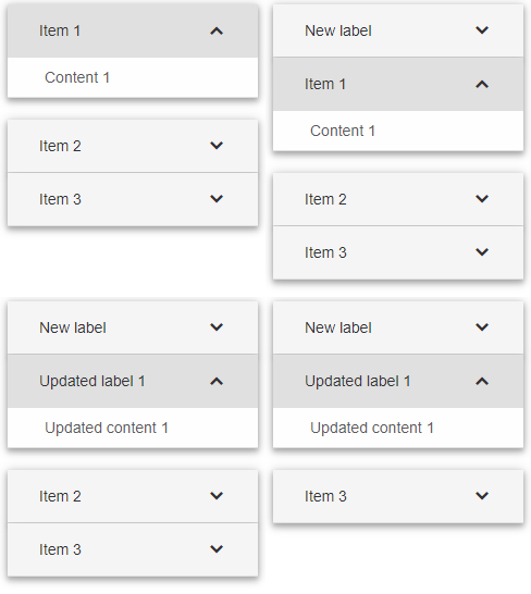
		accordion.insert(0, { "label": "New label", "content": "New content" });
		accordion.update(1, { "label": "Updated label 1", "content": "Updated content 1 " });
		accordion.remove(2);
	 }
	 </script>
	</head>
	<body>
	 <smart-accordion>
	  <smart-accordion-item label="Item 1" content="Content 1" expanded></smart-accordion-item>
	  <smart-accordion-item label="Item 2" content="Content 2"></smart-accordion-item>
	  <smart-accordion-item label="Item 3" content="Content 3"></smart-accordion-item>
	 </smart-accordion>
	</body>
	</html>
Demo

Behavior
User can expand/collapse items according to the current expandMode:- 'single' - only one item can be expanded. If the expanded item's height is greater than the value of the height property, a vertical scrollbar is shown.
- 'singleFitHeight' - only one item can be expanded. If the expanded item's height is greater than the value of the height property, a vertical scrollbar is shown inside the content of the expanded item.
- 'multiple' - multiple items can be expanded. If the expanded item's height is greater than the value of the height property, a vertical scrollbar is shown.
- 'toggle' - only one item can be expanded. The expanded item can also be collapsed. If the expanded item's height is greater than the value of the height property, a vertical scrollbar is shown.
- 'none' - no items can be expanded/collapsed.
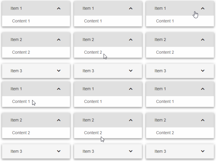
 <smart-accordion expand-mode="multiple" expanded-indexes="[0,1]">
	  <smart-accordion-item label="Item 1" content="Content 1" expanded></smart-accordion-item>
	  <smart-accordion-item label="Item 2" content="Content 2"></smart-accordion-item>
	  <smart-accordion-item label="Item 3" content="Content 3"></smart-accordion-item>
	 </smart-accordion>
Demo

<!DOCTYPE html>
	<html lang="en">
	<head>
	 <link rel="stylesheet" href="../../source/styles/smart.default.css" type="text/css" />
	 <script type="text/javascript" src="../../source/modules/smart.accordion.js"></script>
	 <script>
	 window.onload = function () {
		let accordion = document.querySelector('smart-accordion');
		accordion.expandMode = 'multiple';
		accordion.expand(1);
		accordion.expand(2);
		accordion.collapse(0);
	 }
	 </script>
	</head>
	<body>
	 <smart-accordion>
	  <smart-accordion-item label="Item 1" content="Content 1" expanded></smart-accordion-item>
	  <smart-accordion-item label="Item 2" content="Content 2"></smart-accordion-item>
	  <smart-accordion-item label="Item 3" content="Content 3"></smart-accordion-item>
	 </smart-accordion>
	</body>
	</html>

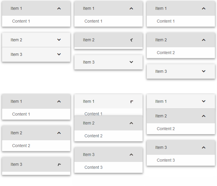
The animation class added in Smart.Accordion, produces smooth animation in the transition between expanded and collapsed state of the accordion items. The speed of the animation is defined in --smart-accordion-animation-duration CSS variable.
Manipulating the content
The element offers the following methods about item's manipulations:- insert - sets the menu to maximized mode.
<script> window.onload = function () { const accordion = document.querySelector('smart-accordion'); accordion.insert(0, { "label": "New label", "content": "New content" }); } </script> - update - sets the menu to maximized mode.
<script> window.onload = function () { const accordion = document.querySelector('smart-accordion'); accordion.update(0, { "label": "Updated label 0", "content": "Updated content 0 " }); } </script> - remove - sets the menu to maximized mode.
 <script>
		 window.onload = function () {
			 const accordion = document.querySelector('smart-accordion');
			 accordion.remove(0);
		 }
	 </script>
Create, Append, Remove, Get/Set Property, Invoke Method, Bind to Event
Create a new element:
const accordion = document.createElement('smart-accordion');
Append it to the DOM:
document.body.appendChild(accordion);
Remove it from the DOM:
accordion.parentNode.removeChild(accordion);
Set a property:
accordion.propertyName = propertyValue;
Get a property value:
const propertyValue = accordion.propertyName;
Invoke a method:
accordion.methodName(argument1, argument2);
Add Event Listener:
	const eventHandler = (event) => {
	   // your code here.
	};

	accordion.addEventListener(eventName, eventHandler);
Remove Event Listener:
accordion.removeEventListener(eventName, eventHandler, true);
Using with Typescript
Smart Web Components package includes TypeScript definitions which enables strongly-typed access to the Smart UI Components and their configuration.
Inside the download package, the typescript directory contains .d.ts file for each web component and a smart.elements.d.ts typescript definitions file for all web components. Copy the typescript definitions file to your project and in your TypeScript file add a reference to smart.elements.d.ts
Read more about using Smart UI with Typescript.Getting Started with Angular Grid Component
Setup Angular Environment
Angular provides the easiest way to set angular CLI projects using Angular CLI tool.
Install the CLI application globally to your machine.
npm install -g @angular/cli
Create a new Application
ng new smart-angular-grid
Navigate to the created project folder
cd smart-angular-grid
Setup the Grid
Smart UI for Angular is distributed as smart-webcomponents-angular NPM package
- Download and install the package.
Quick Setup with ng-add
Smart Angular UI comes packaged with Angular CLI schematics to make creating Material applications easier. Schematics are included with both @angular/cdk and smart-webcomponents-angular. Once you install the npm packages, they will be available through the Angular CLI.Angular CLI supports the addition of packages through the ng add command. The ng add command provides faster and more user-friendly package installation. To install the Smart UI for Angular package use ng add and add the name of the NPM package.
ng add smart-webcomponents-angular
The ng add smart-webcomponents-angular command executes the following actions:
- Adds the smart-webcomponents-angular package as a dependency.
- Imports the Modules in the current application module.
- Registers the default Smart UI theme in the angular.json file.
- Adds all required peer dependencies to package.json.
- Triggers npm install to install the theme and all peer packages that are added.
Manual Setup
npm install smart-webcomponents-angular
- Adding CSS reference
The following CSS file is available in ../node_modules/smart-webcomponents-angular/ package folder. This can be referenced in [src/styles.css] using following code.@import 'smart-webcomponents-angular/source/styles/smart.default.css';
Another way to achieve the same is to edit the angular.json file and in the styles add the style."styles": [ "node_modules/smart-webcomponents-angular/source/styles/smart.default.css" ]
If you want to use Bootstrap, Fluent or other themes available in the package, you need to add them after 'smart.default.css'. -
Example with Angular Standalone Components
app.component.html
<smart-grid [dataSource]="dataSource" [columns]="columns" #grid></smart-grid>
app.component.ts
 import { Component, ViewChild, AfterViewInit, ViewEncapsulation } from '@angular/core';
import { GridComponent, GridColumn, DataAdapter, Smart } from 'smart-webcomponents-angular/grid';

import { CommonModule } from '@angular/common';
import { RouterOutlet } from '@angular/router';
import { GridModule } from 'smart-webcomponents-angular/grid';

@Component({
    selector: 'app-root',
	standalone: true,
	imports: [CommonModule, GridModule, RouterOutlet],
    templateUrl: './app.component.html',
    styleUrls: ['app.component.css'],
    encapsulation: ViewEncapsulation.None
})

export class AppComponent implements AfterViewInit {
	@ViewChild("grid", { read: GridComponent, static: false }) grid!: GridComponent;

	dataSource: any[] = [
		  { "firstName": "Beate", "lastName": "Wilson", "productName": "Caramel Latte"},
		  { "firstName": "Ian", "lastName": "Nodier", "productName": "Caramel Latte"},
		  { "firstName": "Petra", "lastName": "Vileid", "productName": "Green Tea"},
		  { "firstName": "Mayumi", "lastName": "Ohno", "productName": "Caramel Latte"},
		  { "firstName": "Mayumi", "lastName": "Saylor", "productName": "Espresso con Panna"},
		  { "firstName": "Regina", "lastName": "Fuller", "productName": "Caffe Americano" },
		  { "firstName": "Regina", "lastName": "Burke", "productName": "Caramel Latte"},
		  { "firstName": "Andrew", "lastName": "Petersen", "productName": "Caffe Americano"},
		  { "firstName": "Martin", "lastName": "Ohno", "productName": "Espresso con Panna"},
		  { "firstName": "Beate", "lastName": "Devling", "productName": "Green Tea"},
		  { "firstName": "Sven", "lastName": "Devling", "productName": "Espresso Truffle"},
		  { "firstName": "Petra", "lastName": "Burke", "productName": "Peppermint Mocha Twist"},
		  { "firstName": "Marco", "lastName": "Johnes", "productName": "Caffe Mocha"}
	]

	columns: GridColumn[] = [{
			label: 'First Name',
			dataField: 'firstName'
		},
		{
			label: 'Last Name',
			dataField: 'lastName'
		},
		{
			label: 'Product',
			dataField: 'productName'
		}
	];


    ngAfterViewInit(): void {

    }
}
-
Example with Angular NGModule
app.component.html
<smart-grid [dataSource]="dataSource" [columns]="columns" #grid></smart-grid>
app.component.ts
 import { Component, ViewChild, AfterViewInit, ViewEncapsulation } from '@angular/core';
import { GridComponent, GridColumn, DataAdapter, Smart } from 'smart-webcomponents-angular/grid';

@Component({
    selector: 'app-root',
    templateUrl: './app.component.html',
    styleUrls: ['app.component.css'],
    encapsulation: ViewEncapsulation.None
})

export class AppComponent implements AfterViewInit {
	@ViewChild("grid", { read: GridComponent, static: false }) grid!: GridComponent;

dataSource: any[] = [
		  { "firstName": "Beate", "lastName": "Wilson", "productName": "Caramel Latte"},
		  { "firstName": "Ian", "lastName": "Nodier", "productName": "Caramel Latte"},
		  { "firstName": "Petra", "lastName": "Vileid", "productName": "Green Tea"},
		  { "firstName": "Mayumi", "lastName": "Ohno", "productName": "Caramel Latte"},
		  { "firstName": "Mayumi", "lastName": "Saylor", "productName": "Espresso con Panna"},
		  { "firstName": "Regina", "lastName": "Fuller", "productName": "Caffe Americano" },
		  { "firstName": "Regina", "lastName": "Burke", "productName": "Caramel Latte"},
		  { "firstName": "Andrew", "lastName": "Petersen", "productName": "Caffe Americano"},
		  { "firstName": "Martin", "lastName": "Ohno", "productName": "Espresso con Panna"},
		  { "firstName": "Beate", "lastName": "Devling", "productName": "Green Tea"},
		  { "firstName": "Sven", "lastName": "Devling", "productName": "Espresso Truffle"},
		  { "firstName": "Petra", "lastName": "Burke", "productName": "Peppermint Mocha Twist"},
		  { "firstName": "Marco", "lastName": "Johnes", "productName": "Caffe Mocha"}
	]

	columns: GridColumn[] = [{
			label: 'First Name',
			dataField: 'firstName'
		},
		{
			label: 'Last Name',
			dataField: 'lastName'
		},
		{
			label: 'Product',
			dataField: 'productName'
		}
	];

    ngAfterViewInit(): void {

    }
}
app.module.ts
 import { NgModule } from '@angular/core';
import { BrowserModule } from '@angular/platform-browser';
import { FormsModule } from '@angular/forms';

import { AppComponent } from './app.component';
import { GridModule } from 'smart-webcomponents-angular/grid';

@NgModule({
    declarations: [AppComponent],
    imports: [BrowserModule, FormsModule, GridModule],
    schemas: [],
    providers: [],
    bootstrap: [AppComponent]
})

export class AppModule { }
Running the Angular application
After completing the steps required to render a Grid, run the following command to display the output in your web browser
ng serveand open localhost:4200 in your favorite web browser.
Read more about using Smart UI for Angular: https://www.htmlelements.com/docs/angular-cli/.
Getting Started with React Accordion Component
Setup React Environment
The easiest way to start with React is to use create-react-app. To scaffold your project structure, follow the installation instructions.
	npm install -g create-react-app
	create-react-app my-app
	cd my-app
	npm start
Preparation
Open src/App.js andsrc/App.css
- Remove everything inside the App div tag in src/App.js:
<div className="App"> </div>
- Remove the logo.svg import
- Remove the contents of src/App.css
- Remove src/logo.svg
Setup the Accordion
Smart UI for React is distributed as smart-webcomponents-react NPM package
- Download and install the package.
npm install smart-webcomponents-react
Once installed, import the React Accordion Component and CSS files in your application and render it
app.js
import 'smart-webcomponents-react/source/styles/smart.default.css';
import React from "react";
import ReactDOM from "react-dom";
import { Accordion, AccordionItem } from 'smart-webcomponents-react/accordion';

class App extends React.Component {

	componentDidMount() {

	}

	render() {
		return (
			<div>
			    <Accordion>
			        <AccordionItem label="First Item">First Item Content.</AccordionItem>
			        <AccordionItem label="Second Item">Second Item Content.</AccordionItem>
			        <AccordionItem label="Third Item">Third Item Content.</AccordionItem>
			        <AccordionItem label="Fourth Item">Fourth Item Content.</AccordionItem>
			    </Accordion>
			</div>
		);
	}
}

ReactDOM.render(<App />, document.querySelector("#root"));

export default App;
Running the React application
Start the app withnpm startand open localhost:3000 in your favorite web browser to see the output below:
Read more about using Smart UI for React: https://www.htmlelements.com/docs/react/.
Getting Started with Vue Accordion Component
Setup Vue Environment
We will use vue-cli to get started. Let's install vue-cli
npm install -g @vue/cli
Then we can start creating our Vue.js projects with:
vue create my-project
Setup the Accordion
Open the "my-project" folder and run:
npm install smart-webcomponents
Setup with Vue 3.x
-
Make Vue ignore custom elements defined outside of Vue (e.g., using the Web Components APIs). Otherwise, it will throw a warning about an Unknown custom element, assuming that you forgot to register a global component or misspelled a component name.
Open src/main.js in your favorite text editor and change its contents to the following:
main.js
import { createApp } from 'vue' import App from './App.vue' const app = createApp(App) app.config.isCustomElement = tag => tag.startsWith('smart-'); app.mount('#app') -
Open src/App.vue in your favorite text editor and change its contents to the following:
App.vue
<template>
  <div class="vue-root">
    <smart-accordion id="accordion">
      <smart-accordion-item label="First Item">First Item Content.</smart-accordion-item>
      <smart-accordion-item label="Second Item">Second Item Content.</smart-accordion-item>
      <smart-accordion-item label="Third Item">Third Item Content.</smart-accordion-item>
      <smart-accordion-item label="Fourth Item">Fourth Item Content.</smart-accordion-item>
    </smart-accordion>
  </div>
</template>

<script>
import { onMounted } from "vue";
import "smart-webcomponents/source/styles/smart.default.css";
import "smart-webcomponents/source/modules/smart.accordion.js";

export default {
  name: "app",
  setup() {
    onMounted(() => {});
  }
};
</script>

<style>
smart-accordion {
  width: 300px;
  height: 500px;
}
</style>
We can now use the smart-accordion with Vue 3. Data binding and event handlers will just work right out of the box.
Setup with Vue 2.x
-
Make Vue ignore custom elements defined outside of Vue (e.g., using the Web Components APIs). Otherwise, it will throw a warning about an Unknown custom element, assuming that you forgot to register a global component or misspelled a component name.
Open src/main.js in your favorite text editor and change its contents to the following:
main.js
import Vue from 'vue' import App from './App.vue' Vue.config.productionTip = false Vue.config.ignoredElements = [ 'smart-accordion', 'smart-accordion-item' ] new Vue({ render: h => h(App), }).$mount('#app') -
Open src/App.vue in your favorite text editor and change its contents to the following:
App.vue
<template>
   <smart-accordion>
        <smart-accordion-item label="First Item">First Item Content.</smart-accordion-item>
        <smart-accordion-item label="Second Item">Second Item Content.</smart-accordion-item>
        <smart-accordion-item label="Third Item">Third Item Content.</smart-accordion-item>
        <smart-accordion-item label="Fourth Item">Fourth Item Content.</smart-accordion-item>
    </smart-accordion>
</template>

<script>
import 'smart-webcomponents/source/modules/smart.accordion.js';
import "smart-webcomponents/source/styles/smart.default.css";

export default {
  name: "app"
};
</script>

<style>
  smart-accordion {
    width: 300px;
    height: 350px;
  }
</style>
We can now use the smart-accordion with Vue. Data binding and event handlers will just work right out of the box.
We have bound the properties of the smart-accordion to values in our Vue component.
Running the Vue application
Start the app withnpm run serveand open localhost:8080 in your favorite web browser to see the output below:
Read more about using Smart UI for Vue: https://www.htmlelements.com/docs/vue/.