Build your web apps using Smart UI
Smart.Carousel - configuration and usage
Overview
Carousel represents a banner web component which displays images or slides with HTML content.
Getting Started with Carousel Web Component
Smart UI for Web Components is distributed as smart-webcomponents NPM package. You can also get the full download from our website with all demos from the Download page.Setup the Carousel
Smart UI for Web Components is distributed as smart-webcomponents NPM package
- Download and install the package.
npm install smart-webcomponents
- Once installed, import the Carousel module in your application.
<script type="module" src="node_modules/smart-webcomponents/source/modules/smart.carousel.js"></script>
-
Adding CSS reference
The smart.default.css CSS file should be referenced using following code.
<link rel="stylesheet" type="text/css" href="node_modules/smart-webcomponents/source/styles/smart.default.css" />
- Add the Carousel tag to your Web Page
<smart-carousel id="carousel"></smart-carousel>
- Create the Carousel Component
	<script type="module">
		Smart('#carousel', class {
			get properties() {
				return  { dataSource:  [{ label: 'Slide 1', content: 'Content 1'}, { label: 'Slide 2', content: 'Content 2'}, { label: 'Slide 3', content: 'Content 3'}] }
			}
		});
	</script>
Another option is to create the Carousel is by using the traditional Javascript way:
	const carousel = document.createElement('smart-carousel');

	carousel.disabled = true;
	document.body.appendChild(carousel);
Smart framework provides a way to dynamically create a web component on demand from a DIV tag which is used as a host. The following imports the web component's module and creates it on demand, when the document is ready. The #carousel is the ID of a DIV tag.
	import "../../source/modules/smart.carousel.js";

	document.readyState === 'complete' ? init() : window.onload = init;

	function init() {
		const carousel = new Smart.Carousel('#carousel',  { dataSource:  [{ label: 'Slide 1', content: 'Content 1'}, { label: 'Slide 2', content: 'Content 2'}, { label: 'Slide 3', content: 'Content 3'}] });
	}
- Open the page in your web server.
The following code adds the custom element to the page.
<!DOCTYPE html> <html lang="en"> <head> <link rel="stylesheet" href="../../source/styles/smart.default.css" type="text/css" /> <script type="text/javascript" src="../../source/smart.button.js"></script> <script type="text/javascript" src="../../source/smart.carousel.js"></script> </head> <body> <smart-carousel hide-indicators display-mode="3d" data-source="..."></smart-carousel> </body> </html>Demo

Note how smart.element.js is declared before everything else. This is mandatory for all custom elements.
Appearance
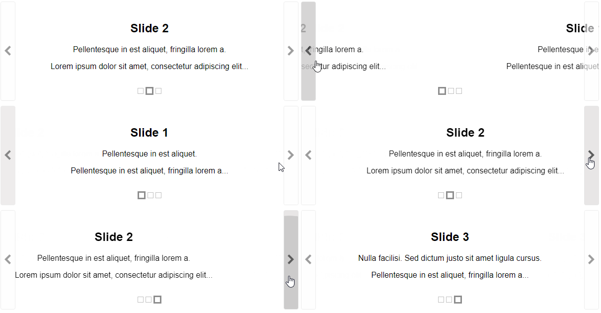
Carousel's structure can be presented as navigation and presentation elements. Navigation elements are arrows(left and right) and indicators. Presentation elements are carousel's slides.
By default each slide can contain following elements:
- label - Headline part of the slide.
- content - Text content of the slide.
- image - By default used as background image.
- HTMLcontent - Custom HTML content. If the user want each slide to be with different structure.
Slides can be loaded from dataSource object( with label, content, image, HTMLcontent fields) or UL element(each list item represents different slide).
Loading via dataSource property:
<!DOCTYPE html>
<html lang="en">
<head>
 <link rel="stylesheet" href="../../source/styles/smart.default.css" type="text/css" />
 <script type="text/javascript" src="../../source/smart.element.js"></script>
 <script type="text/javascript" src="../../source/smart.button.js"></script>
 <script type="text/javascript" src="../../source/smart.carousel.js"></script>
</head>
<body>
 <smart-carousel data-source="..."></smart-carousel>
</body>
</html>
Loading via UL:
<!DOCTYPE html>
<html lang="en">
<head>
 <link rel="stylesheet" href="../../source/styles/smart.default.css" type="text/css" />
 <script type="text/javascript" src="../../source/smart.element.js"></script>
 <script type="text/javascript" src="../../source/smart.button.js"></script>
 <script type="text/javascript" src="../../source/smart.carousel.js"></script>
</head>
<body>
 <smart-carousel>
  <ul>
      <li><span>Item 1</span></li>
      <li><span>Item 2</span></li>
      <li><span>Item 3</span></li>
  </ul>
 </smart-carousel>
</body>
</html>
Navigation elements can be enabled/disabled via fillowing boolean properties:
- hideArrows - By default carousel arrows are visible. They are navigation buttons stored typically on the left and right side of the carousel. With them, the user can navigate back and forth between slides.
- hideIndicators - By default carousel indicators are visible. They are presented as a row of small boxes, corresponding to the active slide position. The active item is visually recognizable.
 <smart-carousel>
  <ul>
      <li>
        <span>Slide 1</span>
        <p>Pellentesque in est aliquet.</p>
        <p>Pellentesque in est aliquet, fringilla lorem a...</p>
      </li>
      <li>
        <span>Slide 2</span>
        <p>Pellentesque in est aliquet, fringilla lorem a. </p>
        <p>Lorem ipsum dolor sit amet, consectetur adipiscing elit...</p>
      </li>
      <li>
        <span>Slide 3</span>
        <p>Nulla facilisi. Sed dictum justo sit amet ligula cursus.</p>
        <p>Pellentesque in est aliquet, fringilla lorem a...</p>
      </li>
  </ul>
 </smart-carousel>
Demo

Behavior
User can navigate between carousel's slides in few displayMode options:
- default - the viewport displays single slide.
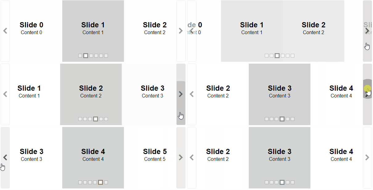
- multiple - multiple slides are shown in the viewport.
- 3d - slides are displayed by layout with 3D perspective.
Default mode:
<smart-carousel display-mode="default" data-source="..."></smart-carousel>
Demo

Multiple mode
<smart-carousel display-mode="multiple" data-source="..."></smart-carousel>
Demo

3d mode
<smart-carousel hide-indicators display-mode="3d" data-source="..."></smart-carousel>
Demo

Setting slideShow to true allows automatic slide rotation by custom interval(in milliseconds).
<smart-carousel slide-show interval="10000" data-source="..."></smart-carousel>
The autoPlay feature allows automatically slideshow start. This property can be set to true or to number(represents custom delay in milliseconds).
<smart-carousel slide-show auto-play data-source="..."></smart-carousel>
<smart-carousel slide-show auto-play="6000" data-source="..."></smart-carousel>
Navigation
smartCarousel allows multiple ways for navigation:
- via arrows - when hideArrows property is set to false.
- via indicators - when hideIndicators property is set to false.
-
via keyboard - to use this feature, set keyboard to true :
Key Action Arrow Right Moves to next slide. Arrow Up Moves to next slide. Arrow Left Moves to previous slide. Arrow Down Moves to previous slide. Home Moves to first slide. End Moves to last slide. - via mouse wheel - to use this feature, set wheel to true.
- via swipe left or swipe right - to use this feature, set swipe to true.
Methods
smartCarousel has the following navigation methods:
- next() - Moves to the slide with the next index.
- pause() - Pauses carousel's slideshow.
- slideTo(index) - Slides to the element with the given index.
- prev() - Moves to the slide with the previous index.
- play() - Starts carousel's slideshow.
Create, Append, Remove, Get/Set Property, Invoke Method, Bind to Event
Create a new element:
const carousel = document.createElement('smart-carousel');
Append it to the DOM:
document.body.appendChild(carousel);
Remove it from the DOM:
carousel.parentNode.removeChild(carousel);
Set a property:
carousel.propertyName = propertyValue;
Get a property value:
const propertyValue = carousel.propertyName;
Invoke a method:
carousel.methodName(argument1, argument2);
Add Event Listener:
	const eventHandler = (event) => {
	   // your code here.
	};

	carousel.addEventListener(eventName, eventHandler);
Remove Event Listener:
carousel.removeEventListener(eventName, eventHandler, true);
Using with Typescript
Smart Web Components package includes TypeScript definitions which enables strongly-typed access to the Smart UI Components and their configuration.
Inside the download package, the typescript directory contains .d.ts file for each web component and a smart.elements.d.ts typescript definitions file for all web components. Copy the typescript definitions file to your project and in your TypeScript file add a reference to smart.elements.d.ts
Read more about using Smart UI with Typescript.Getting Started with Angular Carousel Component
Setup Angular Environment
Angular provides the easiest way to set angular CLI projects using Angular CLI tool.
Install the CLI application globally to your machine.
npm install -g @angular/cli
Create a new Application
ng new smart-angular-carousel
Navigate to the created project folder
cd smart-angular-carousel
Setup the Carousel
Smart UI for Angular is distributed as smart-webcomponents-angular NPM package
- Download and install the package.
npm install smart-webcomponents-angular
- Adding CSS reference
The following CSS file is available in ../node_modules/smart-webcomponents-angular/ package folder. This can be referenced in [src/styles.css] using following code.@import 'smart-webcomponents-angular/source/styles/smart.default.css';
Another way to achieve the same is to edit the angular.json file and in the styles add the style."styles": [ "node_modules/smart-webcomponents-angular/source/styles/smart.default.css" ]
If you want to use Bootstrap, Fluent or other themes available in the package, you need to add them after 'smart.default.css'. -
Example with Angular Standalone Components
app.component.html
<smart-carousel #carousel></smart-carousel>
app.component.ts
 import { Component, ViewChild, OnInit, AfterViewInit } from '@angular/core';
import { CarouselComponent } from 'smart-webcomponents-angular/carousel';


import { CommonModule } from '@angular/common';
import { RouterOutlet } from '@angular/router';
import { CarouselModule } from 'smart-webcomponents-angular/carousel';

@Component({
    selector: 'app-root',
	standalone: true,
	imports: [CommonModule, CarouselModule, RouterOutlet],
    templateUrl: './app.component.html',
    styleUrls: ['./app.component.css']
})

export class AppComponent implements AfterViewInit, OnInit {

    @ViewChild('carousel', { read: CarouselComponent, static: false }) carousel!: CarouselComponent;

    ngOnInit(): void {
        // onInit code.
    }

    ngAfterViewInit(): void {
        // afterViewInit code.
        this.init();
    }

    init(): void {
        // init code.


        const basePath = '../../../src/images/';

        this.carousel.dataSource = generateDataSource(6);

        function generateDataSource(items: number) {
            const dataSource = Array(items).fill({});
            dataSource.forEach((element, index) => dataSource[index] = {
                image: `${basePath}carousel-medium-${index + 1}.jpg`,
                label: 'Slide ' + index,
                content: 'Content ' + index
            });
            return dataSource;
        }


    }
}
-
Example with Angular NGModule
app.component.html
<smart-carousel #carousel></smart-carousel>
app.component.ts
 import { Component, ViewChild, OnInit, AfterViewInit } from '@angular/core';
import { CarouselComponent } from 'smart-webcomponents-angular/carousel';


@Component({
    selector: 'app-root',
    templateUrl: './app.component.html',
    styleUrls: ['./app.component.css']
})

export class AppComponent implements AfterViewInit, OnInit {

    @ViewChild('carousel', { read: CarouselComponent, static: false }) carousel!: CarouselComponent;

    ngOnInit(): void {
        // onInit code.
    }

    ngAfterViewInit(): void {
        // afterViewInit code.
        this.init();
    }

    init(): void {
        // init code.


        const basePath = '../../../src/images/';

        this.carousel.dataSource = generateDataSource(6);

        function generateDataSource(items: number) {
            const dataSource = Array(items).fill({});
            dataSource.forEach((element, index) => dataSource[index] = {
                image: `${basePath}carousel-medium-${index + 1}.jpg`,
                label: 'Slide ' + index,
                content: 'Content ' + index
            });
            return dataSource;
        }


    }
}
app.module.ts
 import { NgModule } from '@angular/core';
import { BrowserModule } from '@angular/platform-browser';

import { CarouselModule } from 'smart-webcomponents-angular/carousel';

import { AppComponent } from './app.component';

@NgModule({
    declarations: [ AppComponent ],
    imports: [ BrowserModule, CarouselModule ],
    bootstrap: [ AppComponent ]
})

export class AppModule { }
Running the Angular application
After completing the steps required to render a Carousel, run the following command to display the output in your web browser
ng serveand open localhost:4200 in your favorite web browser.
Read more about using Smart UI for Angular: https://www.htmlelements.com/docs/angular-cli/.
Getting Started with React Carousel Component
Setup React Environment
The easiest way to start with React is to use NextJS Next.js is a full-stack React framework. It’s versatile and lets you create React apps of any size—from a mostly static blog to a complex dynamic application.
npx create-next-app my-app
cd my-app
npm run dev
or
yarn create next-app my-app
cd my-app
yarn run dev
Preparation
Setup the Carousel
Smart UI for React is distributed as smart-webcomponents-react package
- Download and install the package.
In your React Next.js project, run one of the following commands to install Smart UI Carousel for ReactWith NPM:
npm install smart-webcomponents-react
With Yarn:yarn add smart-webcomponents-react
- Once installed, import the React Carousel Component and CSS files in your application and render it.
app.js
import 'smart-webcomponents-react/source/styles/smart.default.css';
import React from "react";
import ReactDOM from 'react-dom/client';
import { Carousel } from 'smart-webcomponents-react/carousel';

const App = () => {
	const generateDataSource = (items) => {
		const basePath = 'https://www.htmlelements.com/demos/images/';
		const dataSource = Array(items).fill({});

		dataSource.forEach((element, index) => dataSource[index] = {
			image: `${basePath}carousel-medium-${index + 1}.jpg`,
			label: 'Slide ' + index,
			content: 'Content ' + index
		});

		return dataSource
	}

	return (
		<Carousel dataSource={generateDataSource(6)}></Carousel>
	);
}


export default App;
Running the React application
Start the app withnpm run devor
yarn run devand open localhost:3000 in your favorite web browser to see the output.
Setup with Vite
Vite (French word for "quick", pronounced /vit/, like "veet") is a build tool that aims to provide a faster and leaner development experience for modern web projectsWith NPM:
npm create vite@latestWith Yarn:
yarn create viteThen follow the prompts and choose React as a project.
Navigate to your project's directory. By default it is 'vite-project' and install Smart UI for React
In your Vite project, run one of the following commands to install Smart UI Carousel for ReactWith NPM:
npm install smart-webcomponents-reactWith Yarn:
yarn add smart-webcomponents-reactOpen src/App.tsx App.tsx
import 'smart-webcomponents-react/source/styles/smart.default.css';
import React from "react";
import ReactDOM from 'react-dom/client';
import { Carousel } from 'smart-webcomponents-react/carousel';

const App = () => {
	const generateDataSource = (items) => {
		const basePath = 'https://www.htmlelements.com/demos/images/';
		const dataSource = Array(items).fill({});

		dataSource.forEach((element, index) => dataSource[index] = {
			image: `${basePath}carousel-medium-${index + 1}.jpg`,
			label: 'Slide ' + index,
			content: 'Content ' + index
		});

		return dataSource
	}

	return (
		<Carousel dataSource={generateDataSource(6)}></Carousel>
	);
}


export default App;
Read more about using Smart UI for React: https://www.htmlelements.com/docs/react/.
Getting Started with Vue Carousel Component
Setup Vue with Vite
In this section we will introduce how to scaffold a Vue Single Page Application on your local machine. The created project will be using a build setup based on Vite and allow us to use Vue Single-File Components (SFCs). Run the following command in your command linenpm create vue@latestThis command will install and execute create-vue, the official Vue project scaffolding tool. You will be presented with prompts for several optional features such as TypeScript and testing support:
✔ Project name: …If you are unsure about an option, simply choose No by hitting enter for now. Once the project is created, follow the instructions to install dependencies and start the dev server:✔ Add TypeScript? … No / Yes ✔ Add JSX Support? … No / Yes ✔ Add Vue Router for Single Page Application development? … No / Yes ✔ Add Pinia for state management? … No / Yes ✔ Add Vitest for Unit testing? … No / Yes ✔ Add an End-to-End Testing Solution? … No / Cypress / Playwright ✔ Add ESLint for code quality? … No / Yes ✔ Add Prettier for code formatting? … No / Yes Scaffolding project in ./ ... Done.
cdnpm install npm install smart-webcomponents npm run dev
-
Make Vue ignore custom elements defined outside of Vue (e.g., using the Web Components APIs). Otherwise, it will throw a warning about an Unknown custom element, assuming that you forgot to register a global component or misspelled a component name.
Open src/main.js in your favorite text editor and change its contents to the following:
main.js
import { createApp } from 'vue' import App from './App.vue' const app = createApp(App) app.config.isCustomElement = tag => tag.startsWith('smart-'); app.mount('#app') -
Open src/App.vue in your favorite text editor and change its contents to the following:
App.vue
<template>
  <div class="vue-root">
    <smart-carousel></smart-carousel>
  </div>
</template>

<script>
import { onMounted } from "vue";
import "smart-webcomponents/source/styles/smart.default.css";
import "smart-webcomponents/source/modules/smart.carousel.js";

export default {
  name: "app",
  setup() {
    onMounted(() => {
      const basePath = "../../../images/",
        carousel = document.querySelector("smart-carousel");
      carousel.dataSource = generateDataSource(6);

      function generateDataSource(items) {
        const dataSource = Array(items).fill({});
        dataSource.forEach(
          (element, index) =>
            (dataSource[index] = {
              image: `${basePath}carousel-medium-${index + 1}.jpg`,
              label: "Slide " + index,
              content: "Content " + index
            })
        );
        return dataSource;
      }
    });
  }
};
</script>

<style>
smart-carousel .smart-carousel-item .smart-carousel-item-content,
smart-carousel .smart-carousel-item .smart-carousel-item-label {
  font-size: 48px;
  color: #fafafa;
}

@media screen and (max-width: 700px) {
  smart-carousel {
    width: 100%;
  }
}
</style>
We can now use the smart-carousel with Vue 3. Data binding and event handlers will just work right out of the box.
Running the Vue application
Start the app withnpm run serveand open http://localhost:5173/ in your favorite web browser to see the output below:
When you are ready to ship your app to production, run the following:
npm run buildThis will create a production-ready build of your app in the project's ./dist directory.
Read more about using Smart UI for Vue: https://www.htmlelements.com/docs/vue/.