Coming Soon to Smart.Grid: Copy Selection with Marching Ants Effect✨ Coming Soon to Smart.Grid: Copy Selection with Marching Ants EffectDate: April 14, 2025 The Smart UI team is introducing a brand-new feature that brings the Smart.Grid even closer to desktop spreadsheet experiences: Copy Selection with Marching Ants Effect 🎉 📌 What Is the Marching Ants Effect?The "marching ants" effect is a dotted, animated border commonly seen in graphic editing tools like Photoshop and spreadsheet apps like Excel. It visually indicates a selected area, making it clear to the user what’s about to be copied or interacted with.
Smart.Grid will soon support copy selections with animated borders, giving users immediate visual feedback for their clipboard actions.
🧩 Why It Matters
🚀 How It WorksOnce implemented, users will be able to:
💡 Final ThoughtsWhether you’re building complex data dashboards or spreadsheet-like applications, this upcoming update to Smart.Grid will help you deliver a more polished and intuitive experience to your users. Stay tuned! The Marching Ants copy feature is scheduled for release in an upcoming Smart UI update. For the latest changes and demos, visit htmlelements.com. Posted in: Angular, HTML Elements, Javascript, React, Smart Grid, Vue, Web Components Leave a comment Introducing New Features in Smart.Editor: A Game-Changer for Productivity
We’re excited to announce a major update to Smart.Editor, coming this April! This release brings powerful new features that will revolutionize the way you work with content. Whether you’re managing projects, collaborating with teams, or taking detailed notes, our latest enhancements are designed to boost efficiency and streamline your workflow. Here’s what’s new in Smart.Editor:
✨ Multiple Pages for Seamless Organization Gone are the days of cluttered documents! With Multiple Pages, you can now create, navigate, and manage multiple pages within a single document. Stay organized and keep your workspace clean while handling extensive content effortlessly. 💡 Callout Command for Emphasizing Key Information Need to highlight important details? The Callout Command allows you to insert visually distinct callout blocks to draw attention to crucial points, warnings, tips, or notes—helping you and your team focus on what truly matters. ✅ Tasks Command for Actionable To-Dos Turn your notes into action with the Tasks Command. Effortlessly create to-do lists, track progress, and manage tasks within your document. Keep yourself and your team accountable without switching between different apps. 📅 Insert Date Command for Quick Time References Easily insert dates into your content with the new Insert Date Command. Whether you’re setting deadlines, logging events, or keeping track of project milestones, adding timestamps has never been easier. 🤖 AI-Powered Text Generation for Smarter Writing Unleash the power of AI with intelligent text generation. Need help drafting ideas, summarizing information, or expanding on a concept? Our AI assistant provides context-aware suggestions to help you write faster and more effectively. 🔮 Auto-Suggest for Faster Typing Speed up your workflow with Auto-Suggest, which predicts and recommends words and phrases as you type. This feature enhances productivity by reducing typing effort while ensuring more accurate and relevant content creation. 🔄 Draggable Blocks for Effortless Reorganization Easily rearrange your content with Draggable Blocks. Move paragraphs, lists, and sections around with a simple drag-and-drop action, making document structuring more intuitive and flexible. 😀 Emojis for Expressive Content Add a personal touch to your notes and communication with Emoji Support. Express emotions, highlight ideas, and make your content more engaging with a variety of built-in emojis. 📏 Divider for Better Content Structuring Keep your content visually appealing and well-structured with the Divider feature. Use it to separate sections, improve readability, and enhance the overall layout of your document. 🔽 Toggle List for Collapsible Content Declutter your document with Toggle Lists—collapsible sections that allow you to hide or reveal content as needed. Perfect for organizing information without overwhelming the reader. 👤 Users Mention for Seamless Collaboration Collaborate smarter with Users Mention, which allows you to tag team members directly in your document. Keep everyone in the loop and ensure faster responses without switching to another platform. …And More! This release includes various performance improvements, bug fixes, and usability enhancements to ensure a smoother and more intuitive experience for all users. 🚀 Experience the New Smart.Editor in April We can’t wait for you to try out these exciting new features! Smart.Editor is evolving to become the ultimate workspace for content creation, collaboration, and productivity. Stay tuned for more updates, and as always, we’d love to hear your feedback! Let us know which features you’re most excited about in the comments below! 👇 Posted in: Angular, HTML Elements, Javascript, React, Vue, Web Components Tagged: ai editor, editor, smart editor Leave a comment Smart UI 22.0.0
What's New:
DropDownTree Component - Introduced a new rendering mode, allowing the tree component to be rendered within a dropdown. React 19 support. Grid - Added an option for custom summaries. What's Improved: Grid - Enhanced column header rendering with support for custom class names. Grid - new context menu options for insert/remove row, comments, etc. Scheduler - Improved list navigation for a smoother user experience. What's Fixed: Grid - resolved navigation issues with frozen columns when using arrow keys. Grid - fixed column autosize functionality on double-click. Grid - corrected column autosize behavior for datetime columns. Grid - addressed issues with conditional formatting. Grid - tree grid load-on-demand issues during dynamic scrolling. Grid - corrected data export to CSV, ensuring proper handling of Cyrillic characters. Grid - resolved issues with exporting to Excel when 'cellsFormat' set to 'd' was applied to numeric fields. Pivot Table - Fixed issues with column hierarchies and the pivot designer. Pivot Table - Corrected problems when clearing the data source and dynamically applying a new one. DropDownTree will be available in the next release of Smart UI
Introducing the DropDownTree Component in Smart UI
We're thrilled to announce the upcoming release of a new and powerful component for the Smart UI toolkit: the DropDownTree. Designed to elevate user experience and simplify complex data interactions, the DropDownTree will be available in the next release of Smart UI. What is the DropDownTree? The DropDownTree combines the flexibility of a dropdown menu with the hierarchical structure of a tree view. It allows users to explore, navigate, and select items from nested data structures efficiently, making it ideal for applications that manage large datasets or require multi-level categorization. Key Features:
Who Will Benefit? The DropDownTree is perfect for developers building dashboards, e-commerce platforms, project management tools, or any application that needs to present and manipulate hierarchical data intuitively. When to Expect It? The DropDownTree component is planned for inclusion in the next Smart UI release, bringing even more versatility to our growing toolkit. Stay tuned for more updates and a detailed demo of the DropDownTree in action. We can’t wait to see how you use it in your projects! Smart UI ver. 21.0.0Smart UI v21.0.0 Release, Dec-01-2024What's New:
What's Improved:
What's Fixed:
What’s New in Our Latest Release: Exciting Features and Improvements
We're thrilled to introduce a fresh set of powerful tools and improvements in our latest release. This update is packed with new components, expanded functionality, and enhanced performance, all designed to boost your productivity and provide even greater control over your UI. Let's dive into what's new, what's improved, and the fixes that are making this release our best yet.
New Features1. Timeline Component The new Timeline component allows you to display a chronological collection of events effortlessly. Whether you're working on a historical timeline or an event log, you can render the timeline vertically or horizontally. Plus, it's highly customizable with CSS, ensuring that it aligns with your design vision perfectly. 2. Design Blocks We've added Design blocks, a set of small, pre-designed UI elements that will fast-track your development process. Use them to quickly assemble Shells, Checkout forms, Contact pages, Login forms, Overlays, or Site navigation. No more building these elements from scratch—just grab, customize, and deploy! 3. Grid Conditional Formatting Based on Select Column With conditional formatting, your Grid component just got smarter! Now, you can apply conditional formatting based on a selected column, making data easier to interpret and analyze at a glance. 4. Grid AI Column Take advantage of the new AI column in the Grid component. It enables you to send prompts and update cells either in the same column or across other columns dynamically. This functionality opens the door to more intelligent data handling and automated actions. 5. Scheduler Auto-Create Dialog Managing schedules has never been simpler. The Auto-Create dialog in the Scheduler allows users to quickly create events after selecting a cell or a range of cells. This feature accelerates the scheduling process and improves user efficiency. 6. Enhanced Scheduler Features Now, the Scheduler allows dynamic scheduling or unscheduling of events through a built-in UI, complete with drag-and-drop functionality. There's also an option to disable conflicts, which prevents multiple events from being scheduled in the same time slot—making it easier to maintain an organized and conflict-free schedule. 7. TextArea Rich Text Formatting The TextArea component now includes advanced formatting options for background and color when used in rich text mode, giving users more control over the presentation of their content. 8. Localization Files Added We've added localization support for Italian, Spanish, French, German, Korean, Japanese, and Chinese to key components like the Grid, Gantt, Editor, and Scheduler, making it easier to build globally accessible applications. Improved Features1. Grid Checkbox Column Templates The Grid Checkbox column has been enhanced with new templates, allowing you to choose from multiple predefined checkbox styles. This added flexibility means you can easily match the checkbox design to your application's overall look and feel. 2. Grid Selection API The Grid Selection API has been expanded to make row selection and data retrieval smoother and more intuitive. Whether you're selecting single rows or multiple rows, this API upgrade will make it easier to manage and manipulate data. 3. DateInput Customization The DateInput component now allows further customization of the Calendar popup, offering more ways to tailor date selection to your users' needs. 4. Gantt Task and Tooltip Formatting We've also improved the Gantt component, allowing more detailed formatting for both tasks and tooltips, giving your Gantt charts a cleaner, more professional appearance. 5. Scheduler API Enhancements The Scheduler API has been upgraded with the addition of disableContextMenu and disableEventMenu options for events. This provides even more control over user interactions within the scheduler, allowing you to fine-tune what users can do with event entries. 6. Special Dates API for Scheduler The new special dates API allows you to define and highlight specific dates in the Scheduler with different colors, making it easier for users to identify important events or holidays. 7. Gantt scrollTo Method We’ve added a new scrollTo method for the Gantt component, ensuring users can quickly navigate to specific tasks or dates within the chart. 8. Improved Mobile Experience ListBox, DropDownList, and ComboBox now feature native scrolling on mobile devices, making them more intuitive and responsive on phones and tablets. Bug FixesIn this release, we've also addressed several key issues: Grid Auto Height Mode: Resolved an issue when paging was enabled, improving layout consistency. Grid Row Selection: Fixed an issue related to row selection when paging is enabled and selectAllMode is set to ‘all’. Null Filter Issue in Grid: Using a filter with a NULL condition now works correctly, even without a specified value. Grid Column Reorder: The filter icon now displays correctly after a column reorder. Kanban Column Colors: Fixed issues where incorrect styles were applied to Kanban tasks. Kanban Rendering with Swimlanes: Addressed rendering problems when swimlanes were dynamically shown or hidden. Kanban Task Custom Fields: Custom fields are now applied and updated correctly. Input Aria-Hidden Attribute: Corrected an issue with the aria-hidden WAI-ARIA attribute in Input components. Accordion Expand/Collapse: Fixed issues related to nested accordions and their expand/collapse behavior. ConclusionWith these exciting new features, improvements, and bug fixes, our latest release is designed to make your workflow smoother and your user interfaces more dynamic and responsive. Whether you're working with grids, schedulers, forms, or timelines, this release has something for everyone.We look forward to seeing how you'll use these new tools to create amazing applications! Conflict-Free Scheduling
Introducing the Conflict-Free Scheduling feature in Smart.Scheduler! This innovative enhancement ensures seamless scheduling by preventing users from dragging, dropping, or resizing an event into an already occupied time slot. With Conflict-Free Scheduling, double-bookings are a thing of the past. This feature will be part of our upcoming release this month.
Key Benefits:
How It Works:
Timeline Component coming soon
In the next version of Smart UI, we will be adding a new Timeline component. A timeline component is a user interface element used to display a chronological sequence of events or activities along a linear axis. It provides users with a visual representation of time-related data, making it easier to understand the order and relationships between different events.
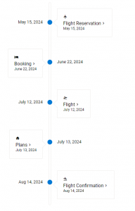
Key features of the timeline component include:
Timeline components are commonly used in a variety of applications, including project management tools, historical websites, educational platforms, and personal storytelling apps. They provide a visually engaging way to present time-related information, making it easier for users to understand and navigate complex chronological data. Smart UI 19.0.0What's New:
What's Improved:
What's Fixed:
Smart UI v18.0.0Smart UI v18.0.0 Release, Jan-24-2024What's New:
What's Improved:
What's Fixed:
New Smart.Blazor Release
The new release brings the following updates:
.NET 8 support for Smart.Blazor
Today, we released a new Smart UI for Blazor version with .NET 8 support.
Build Blazor MAUI Hybrid App with SmartUI
We just added a new tutorial which will show you how to easily integrate Blazor MAUI with SmartUI - https://www.htmlelements.com/docs/blazor-maui/
Smart UI 17.0.0Smart UI v17.0.0 Release, Oct-23-2023What's New:
What's Improved:
What's Fixed:
Posted in: Angular, HTML Elements, Javascript, React, Smart Accordion, Smart Button, Smart Calendar, Smart ComboBox, Smart Grid, Vue, Web Components Tagged: gantt, Grid, kanban, scheduler Leave a comment Smart UI v16.0.1Smart UI v16.0.1 Release, Aug-04-2023What's Improved:
What's Fixed:
Smart UI 15.2.1Smart UI v15.2.1 Release, May-16-2023What's New:
What's improved:
What's Fixed:
Smart UI v15.2Smart UI v15.2.0 Release, Apr-23-2023What's New:
What's Improved:
What's Fixed:
Posted in: Angular, HTML Elements, Javascript, React, Vue, Web Components Tagged: gantt, Grid, scheduler Leave a comment Smart UI R1 2023
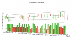
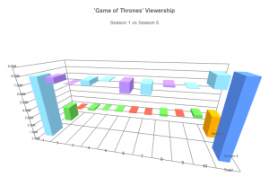
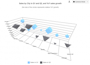
We are happy to announce that a new version of Smart UI is now available. It brings a brand-new 3D Chart component and many other updates which will help you to create better web apps.
What's New:
What's Improved:
What's Fixed:
Smart.Blazor with Support for .NET 7
We are excited to announce that a new version of Smart.Blazor is available today. The new version comes with support for .NET 7 Release and includes multiple updates in the Grid, Scheduler and Kanban components.
 Artavolo – Cloud collaboration service for everyone
We are happy to announce that we launched our new product called Artavolo. Artavolo puts the power of building a custom database in everyday user's hands.
Artavolo is a modern online database service created for everyone, and it gives people the simplicity of a spreadsheet, tools for team collaboration, and a seamless mobile experience. We are just getting started on our mission to expand productivity by giving people simple and useful tools to organize their world. Artavolo is perfect for project management, collecting customer information, creating surveys, and planning events. All of this without any technical expertise.
To learn more about Artavolo - https://artavolo.com/
Smart UI 14.4.0Smart UI v14.4.0 Release, Sep-29-2022What's New:
What's Improved:
What's Fixed:
Customer Satisfaction Survey
We would like to ask you to complete a simple anonymous Online Survey that should take no more than 30 seconds. Thank you in advance for sharing your thoughts with us. We appreciate your time and effort in providing feedback to us.
Smart UI v14.2.0Smart UI v14.2.0 Release, July-12-2022What's New:
What's Improved:
What's Fixed:
Breaking Changes:
Posted in: Angular, HTML Elements, Javascript, React, Smart Accordion, Smart Button, Smart Calendar, Smart ComboBox, Smart Context Menu, Smart Grid, Smart ListBox, Smart Tabs, Smart.Chart, Uncategorized, Vue, Web Components Tagged: angular, angular material, blazor, bootstrap, datagrid, Grid, grid ui component, grid view, material bootstrap, smart ui, smart ui library, ui components, ui library Leave a comment Free Bootstrap Web Components & more
FREE Bootstrap Web Components. The Github repo: https://github.com/HTMLElements/smart-webcomponents-community contains the following free Bootstrap Javascript Web Components: Alert, Badges, Cards, Buttons, Forms, Tabs, Dropdowns, Modal, Progress, Textarea, Switch, Checkbox, RadioButton.

Within the same repo are the Smart UI Table, Menu, Tabs and Tree components which you can use completely FREE in commercial and non-commercial projects. 
ASP .NET Blazor WASM & .NET 6
We are happy to share with you that the latest Smart.Blazor NuGET package targets .NET 6.0 by default.
The code sample below shows how to create a Blazor WebAssembly app with .NET 6 Blazor WebAssembly (blazorwasm) Example1. Create a blazor application: dotnet new blazorwasm -o BlazorApp 2. Navigate to the application: cd BlazorApp 3. Add the Smart.Blazor package: dotnet add package Smart.Blazor 4. Open _Imports.razor and add the following at the bottom: @using Smart.Blazor 5. Open wwwroot/index.html and add the needed styles and scripts. <!DOCTYPE html>
<html>
<head>
<meta charset="utf-8" />
<meta name="viewport" content="width=device-width, initial-scale=1.0, maximum-scale=1.0, user-scalable=no" />
<title>Blazor WebAssembly App</title>
<base href="/" />
<link href="css/bootstrap/bootstrap.min.css" rel="stylesheet" />
<link href="css/app.css" rel="stylesheet" />
<link href="_framework/scoped.styles.css" rel="stylesheet" />
<link href="_content/Smart.Blazor/css/smart.default.css" rel="stylesheet" />
<script src="_content/Smart.Blazor/js/smart.blazor.js"></script>
<script src="_content/Smart.Blazor/js/smart.elements.js"></script>
</head>
<body>
<div id="app">Loading...</div>
<div id="blazor-error-ui">
An unhandled error has occurred.
<a href="" class="reload">Reload</a>
<a class="dismiss">🗙</a>
</div>
<script src="_framework/blazor.webassembly.js"></script>
</body>
</html>
6. Open Pages/Index.razor and replace the code as follows:@page "/"
@inject HttpClient Http
<h1>Weather forecast</h1>
<p>This component demonstrates fetching data from the server.</p>
@if (forecasts == null)
{
<p><em>Loading...</em></p>
}
else
{
<Table Selection="true" SortMode="TableSortMode.One" class="table">
<table>
<thead>
<tr>
<th>Date</th>
<th>Temp. (C)</th>
<th>Temp. (F)</th>
<th>Summary</th>
</tr>
</thead>
<tbody>
@foreach (var forecast in forecasts)
{
<tr>
<td>@forecast.Date.ToShortDateString()</td>
<td>@forecast.TemperatureC</td>
<td>@forecast.TemperatureF</td>
<td>@forecast.Summary</td>
</tr>
}
</tbody>
</table>
</Table>
}
@code {
private WeatherForecast[] forecasts;
protected override async Task OnInitializedAsync()
{
forecasts = await Http.GetFromJsonAsync<WeatherForecast[]>("sample-data/weather.json");
}
public class WeatherForecast
{
public DateTime Date { get; set; }
public int TemperatureC { get; set; }
public string Summary { get; set; }
public int TemperatureF => 32 + (int)(TemperatureC / 0.5556);
}
}
7. Edit Program.cs
using BlazorApp;
using Microsoft.AspNetCore.Components.Web;
using Microsoft.AspNetCore.Components.WebAssembly.Hosting;
using Smart.Blazor;
var builder = WebAssemblyHostBuilder.CreateDefault(args);
builder.RootComponents.Add<App>("#app");
builder.RootComponents.Add<HeadOutlet>("head::after");
builder.Services.AddScoped(sp => new HttpClient { BaseAddress = new Uri(builder.HostEnvironment.BaseAddress) });
builder.Services.AddSmart();
await builder.Build().RunAsync();
8. Start the app and check the result dotnet watch run Wait for the app to display that it's listening on http://localhost:5000 and then, open a browser and navigate to that address. Once you get to the following page, you have successfully run your first Blazor WebAssembly app using Smart UI for Blazor Components! Output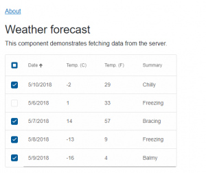
Angular 14
We are happy to announce that the latest version of our Angular UI library smart-webcomponents-angular is tested and ready to use in your Angular 14 projects.
Smart UI 14Smart UI v14.0.0 Release, Apr-18-2022What's New:
What's Fixed:
Smart UI 13.1.26Smart UI v13.1.26 Release, Apr-05-2022What's New:
What's Improved:
What's Fixed:
Smart UI 13.1.0Smart UI v13.1.0 Release, Mar-23-2022What's New:
What's Improved:
What's Fixed:
Breaking changes:Posted in: Angular, HTML Elements, Javascript, React, Smart Accordion, Smart Button, Smart Calendar, Smart ComboBox, Smart Context Menu, Smart Grid, Smart ListBox, Smart Tabs, Smart.Chart, Uncategorized, Vue, Web Components Tagged: calendar, date time picker, dateinput, Grid, kanban, scheduler Leave a comment Smart UI Desktop App with Blazor and Windows FormsBlazor - Desktop CrossplatformGetting StartedThis tutorial will show you how you can use Smart components in a Blazor Desktop app with .NET 6, running in both a web browser and in WinForms. Prerequisites
Before getting started you need to have Visual Studio 2022 with .NET 6 SDK installed. Blazor Server AppFirst, we will start by opening Visual Studio 2022 and creating a Blazor Server App called CrossPlatformBlazor with target framework .NET 6.0 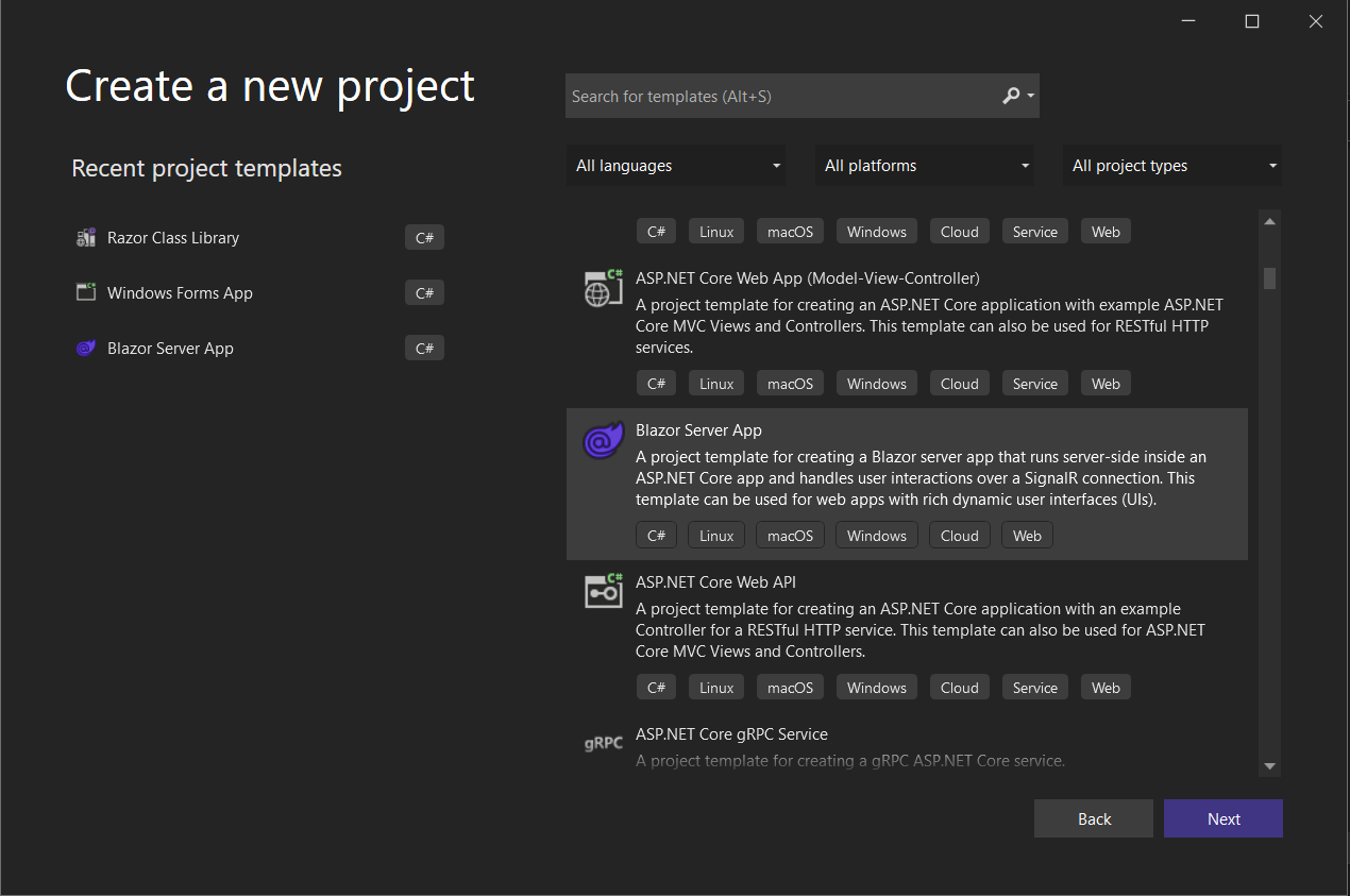
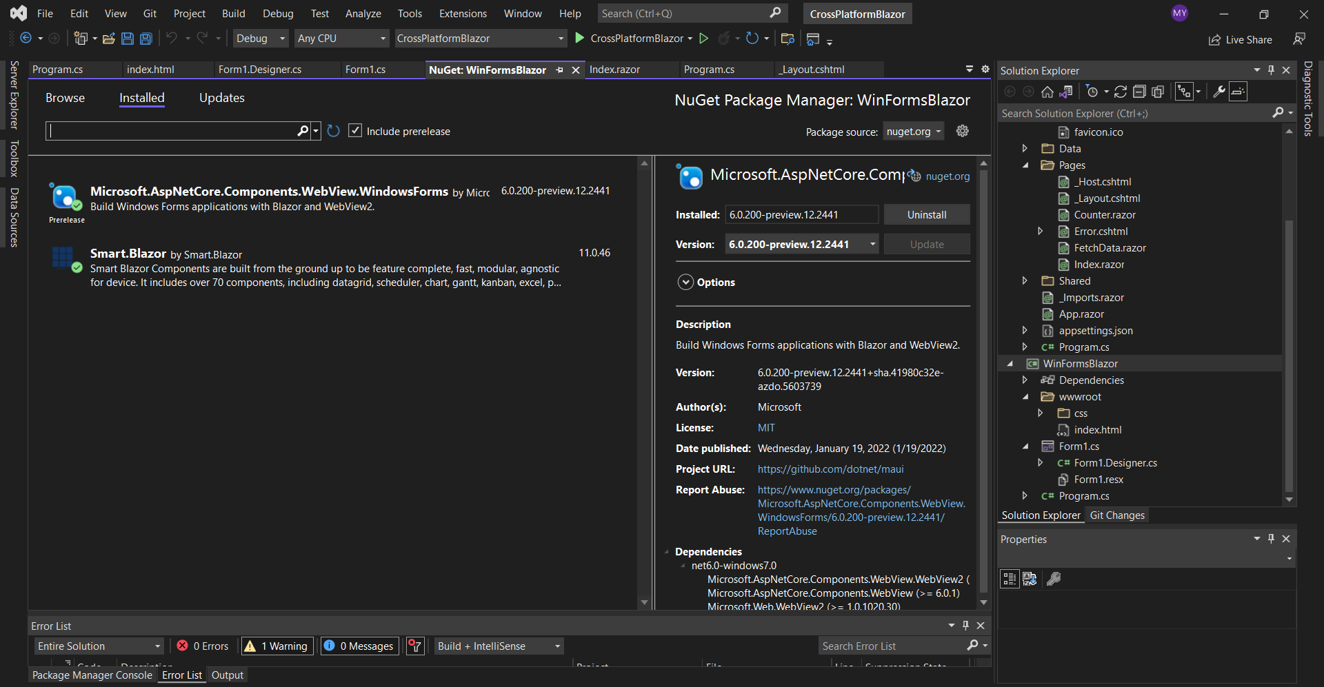
Then we need to add Smart.Blazor NuGet package to the project. 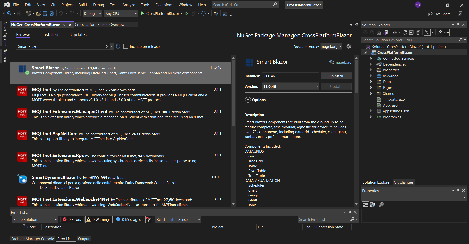
Open the
<link href="_content/Smart.Blazor/css/smart.default.css" rel="stylesheet" />
and Smart source files by adding this snipet:
  <script src="_content/Smart.Blazor/js/smart.blazor.js"><script>
  <script src="_content/Smart.Blazor/js/smart.elements.js"></script>
The next step is to open the Program.cs file and to add
    using CrossPlatformBlazor.Data;
    using Microsoft.AspNetCore.Components;
    using Microsoft.AspNetCore.Components.Web;
    using Smart.Blazor;

    var builder = WebApplication.CreateBuilder(args);

    // Add services to the container.
    builder.Services.AddRazorPages();
    builder.Services.AddServerSideBlazor();
    builder.Services.AddSingleton<WeatherForecastService>();
    // Add Smart UI for Blazor.
    builder.Services.AddSmart();

    var app = builder.Build();

    // Configure the HTTP request pipeline.
    if (!app.Environment.IsDevelopment())
    {
        app.UseExceptionHandler("/Error");
        // The default HSTS value is 30 days. You may want to change this for production scenarios, see https://aka.ms/aspnetcore-hsts.
        app.UseHsts();
    }

    app.UseHttpsRedirection();

    app.UseStaticFiles();

    app.UseRouting();

    app.MapBlazorHub();
    app.MapFallbackToPage("/_Host");

    app.Run();
Now you can open the
    @page "/"
    @using CrossPlatformBlazor.Data

    @inject WeatherForecastService ForecastService

    <h1>Weather forecast</h1>

    <p>This component demonstrates fetching data from the server.</p>

    @if (forecasts == null)
    {
      <p><em>Loading...</em></p>
    }
    else
    {
      <Table Selection="true" SortMode="TableSortMode.One" class="table">
        <table>
          <thead>
            <tr>
              <th>Date</th>
              <th>Temp. (C)</th>
              <th>Temp. (F)</th>
              <th>Summary</th>
            </tr>
          </thead>
          <tbody>
            @foreach (var forecast in forecasts)
            {
              <tr>
                <td>@forecast.Date.ToShortDateString()</td>
                <td>@forecast.TemperatureC</td>
                <td>@forecast.TemperatureF</td>
                <td>@forecast.Summary</td>
              </tr>
            }
          </tbody>
        </table>
      </Table>
    }

    @code {
      private WeatherForecast[] forecasts;

      protected override async Task OnInitializedAsync()
      {
        forecasts = await ForecastService.GetForecastAsync(DateTime.Now);
      }
    }
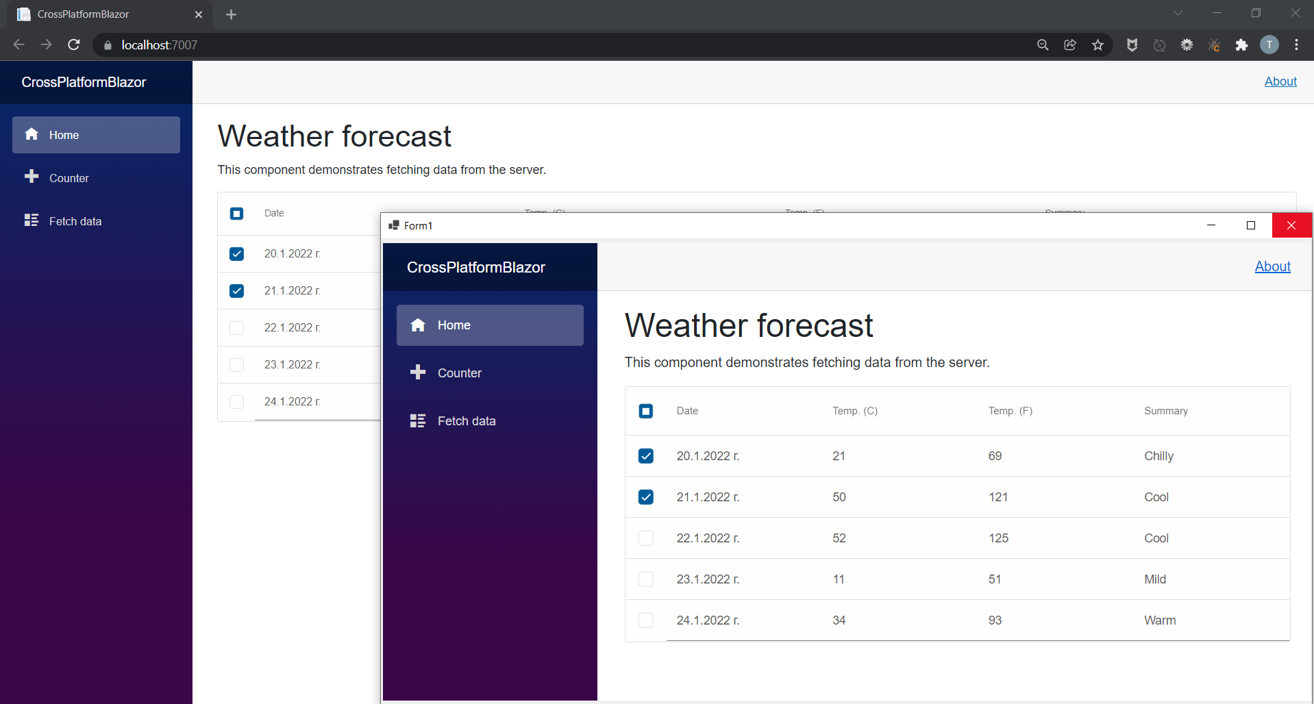
We are ready with the web part of our application. If you run the project you should see the following result: 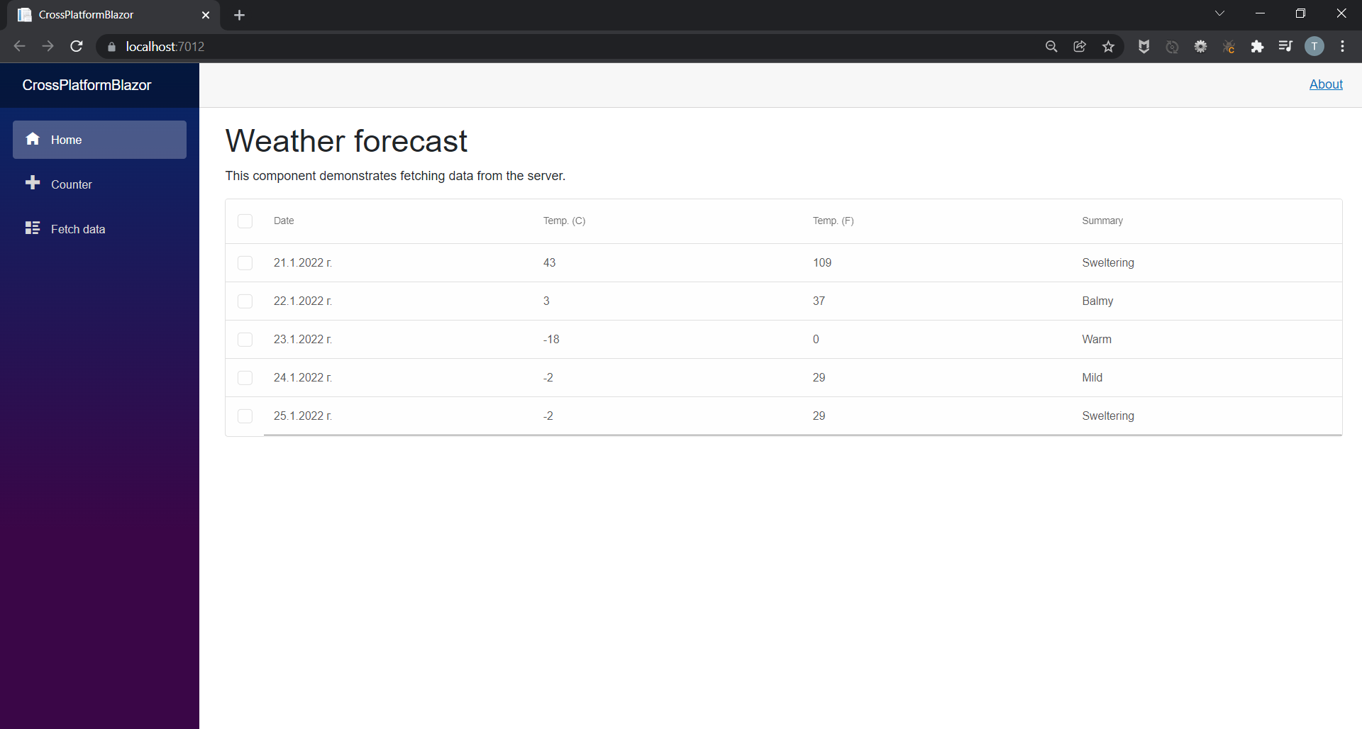
Windows Forms BlazorThe next step is to add a new Windows Forms App to the solution. We will name it WinFormsBlazor. 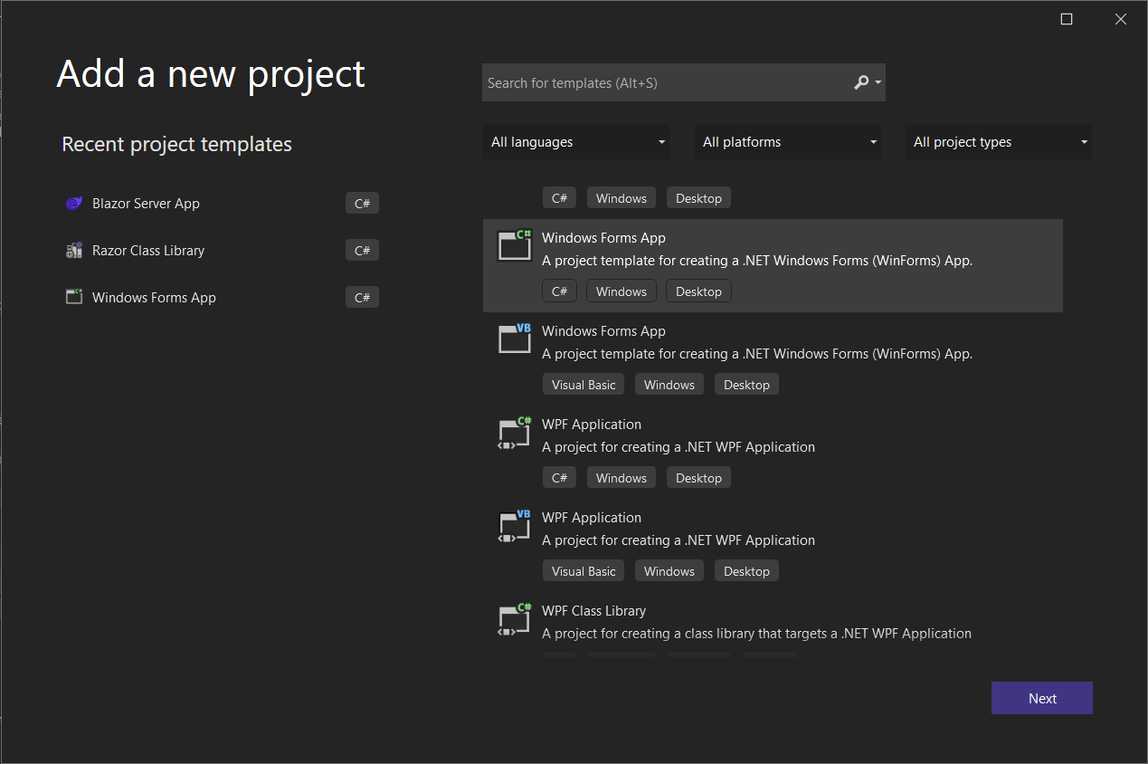
Add the Smart.Blazor and Microsoft.AspNetCore.Components.WebView.WindowsForms NuGet packages to the project.
    <!DOCTYPE html>
    <html>

    <head>
        <meta charset="utf-8" />
        <meta name="viewport" content="width=device-width, initial-scale=1.0, maximum-scale=1.0, user-scalable=no" />
        <title>Blazor WinForms app</title>
        <base href="/" />
        <link rel="stylesheet" href="css/bootstrap/bootstrap.min.css" />
        <link href="css/site.css" rel="stylesheet" />
        <link href="WinFormsBlazor.styles.css" rel="stylesheet" />
        <link href="_content/Smart.Blazor/css/smart.default.css" rel="stylesheet" />

    </head>

    <body>

        <div id="app"></div>

        <div id="blazor-error-ui">
            An unhandled error has occurred.
            <a href="" class="reload">Reload</a>
            <a class="dismiss">🗙</a>
        </div>

        <script src="_framework/blazor.webview.js"></script>
        <script src="_content/Smart.Blazor/js/smart.blazor.js"></script>
        <script src="_content/Smart.Blazor/js/smart.elements.js"></script>
    </body>

    </html>
Blazor Class Library
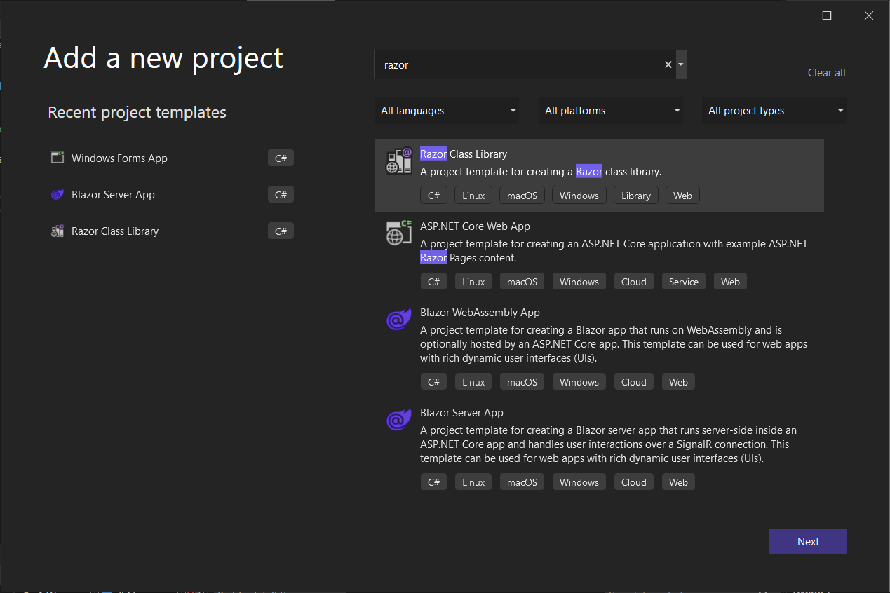
We will extract the code shared between the Blazor Desktop app and the Blazor Server app in a separate Razor Class Library that we will call BlazorClassLibrary.
<Nullable>enable</Nullable>
with
<AddRazorSupportForMvc>true</AddRazorSupportForMvc>
and add:
    <ItemGroup>
        <FrameworkReference Include="Microsoft.AspNetCore.App" />
    </ItemGroup>
Note, that you need to add a reference to the class library in the Blazor Server App and the Windows Forms App by right-clicking on them and choosing Add Project Refrence...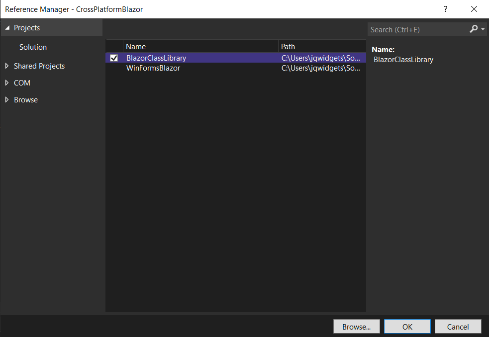 Now you can move Data, Pages, Shared and wwwroot folders and _Imports.razor and App.Razor files from CrossPlatformBlazor to BlazorClassLibrary.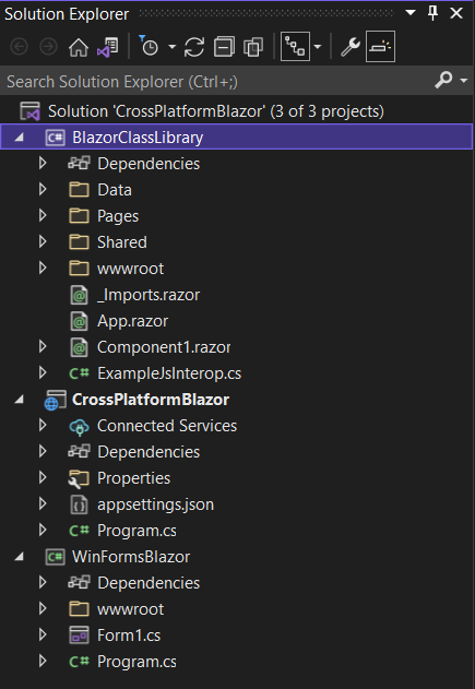 Then you should fix the reference of ILogger inside \Pages\Error.cshtml.cs by adding:
using Microsoft.Extensions.Logging;
Inside _Imports.razor replace:
    @using CrossPlatformBlazor
    @using CrossPlatformBlazor.Shared
with
    @using BlazorClassLibrary
    @using BlazorClassLibrary.Shared
Inside \Pages\_Layout.cshtml file you need to change the references of the css files by replacing:
    <link rel="stylesheet" href="css/bootstrap/bootstrap.min.css" />
    <link href="css/site.css" rel="stylesheet" />
with
    <link rel="stylesheet" href="_content/BlazorClassLibrary/css/bootstrap/bootstrap.min.css" />
    <link href="_content/BlazorClassLibrary/css/site.css" rel="stylesheet" />
And finally, inside \Pages\_Host.cshtml add:
@using BlazorClassLibrary
Final Configurations
Lastly, in the WinFormsBlazor project you should open the
    using BlazorClassLibrary;
    using CrossPlatformBlazor.Data;
    using Microsoft.AspNetCore.Components.WebView.WindowsForms;
    using Microsoft.Extensions.DependencyInjection;
    using Smart.Blazor;

    namespace WinFormsBlazor
    {
        public partial class Form1 : System.Windows.Forms.Form
        {
            public Form1()
            {
                var serviceCollection = new ServiceCollection();
                serviceCollection.AddBlazorWebView();

                serviceCollection.AddSingleton<WeatherForecastService>();

                serviceCollection.AddSmart();

                InitializeComponent();

                blazorWebView1.HostPage = @"wwwroot\index.html";
                blazorWebView1.Services = serviceCollection.BuildServiceProvider();
                blazorWebView1.RootComponents.Add<App>("#app");
            }
        }
    }
Then open also the Form1.Designer.cs file and paste the following code:
    namespace WinFormsBlazor
    {
        partial class Form1
        {
            /// <summary>
            ///  Required designer variable.
            /// </summary>
            private System.ComponentModel.IContainer components = null;

            /// <summary>
            ///  Clean up any resources being used.
            /// </summary>
            /// <param name="disposing">true if managed resources should be disposed; otherwise, false.</param>
            protected override void Dispose(bool disposing)
            {
                if (disposing && (components != null))
                {
                    components.Dispose();
                }
                base.Dispose(disposing);
            }

            #region Windows Form Designer generated code

            /// <summary>
            ///  Required method for Designer support - do not modify
            ///  the contents of this method with the code editor.
            /// </summary>
            private void InitializeComponent()
            {
                this.blazorWebView1 = new Microsoft.AspNetCore.Components.WebView.WindowsForms.BlazorWebView();
                this.SuspendLayout();
                //
                // blazorWebView1
                //
                this.blazorWebView1.Anchor = ((System.Windows.Forms.AnchorStyles)((((System.Windows.Forms.AnchorStyles.Top | System.Windows.Forms.AnchorStyles.Bottom)
                | System.Windows.Forms.AnchorStyles.Left)
                | System.Windows.Forms.AnchorStyles.Right)));
                this.blazorWebView1.Location = new System.Drawing.Point(3, 7);
                this.blazorWebView1.Name = "blazorWebView1";
                this.blazorWebView1.Size = new System.Drawing.Size(796, 436);
                this.blazorWebView1.TabIndex = 20;
                //
                // Form1
                //
                this.AutoScaleDimensions = new System.Drawing.SizeF(8F, 20F);
                this.AutoScaleMode = System.Windows.Forms.AutoScaleMode.Font;
                this.ClientSize = new System.Drawing.Size(800, 450);
                this.Controls.Add(this.blazorWebView1);
                this.Name = "Form1";
                this.Text = "Form1";
                this.ResumeLayout(false);

            }

            #endregion

            private Microsoft.AspNetCore.Components.WebView.WindowsForms.BlazorWebView blazorWebView1;
        }
    }
The last thing you need to do is to open the WinFormsBlazor's project file WinFormsBlazor.csproj and change the first line to:
<Project Sdk="Microsoft.NET.Sdk.Razor">
and add the following lines:
    <ItemGroup>
      <Content Update="wwwroot\**">
        <CopyToOutputDirectory>PreserveNewest</CopyToOutputDirectory>
      </Content>
    </ItemGroup>

    <ItemGroup>
      <Content Update="wwwroot\css\site.css">
        <CopyToOutputDirectory>PreserveNewest</CopyToOutputDirectory>
        <ExcludeFromSingleFile>true</ExcludeFromSingleFile>
        <CopyToPublishDirectory>PreserveNewest</CopyToPublishDirectory>
      </Content>
    </ItemGroup>
Now if you start both the CrossPlatformBlazor and WinFormsBlazor projects you should get the following result: Posted in: Uncategorized Tagged: blazor, blazor desktop, blazor desktop application, blazor server app, windows forms, windows forms blazor Leave a comment Smart UI v12.0.0Smart UI v12.0.0 Release, Jan-20-2022What's New:
What's Fixed:
Posted in: Angular, HTML Elements, Javascript, React, Smart Accordion, Smart Button, Smart Calendar, Smart ComboBox, Smart Grid, Smart ListBox, Smart Tabs, Smart.Chart, Vue, Web Components Tagged: dateinput, Grid, kanban Leave a comment Smart UI for Blazor v11.0.38 Release, Jan-03-2022
We are happy to announce that we have just released the first version of Smart.Blazor for this year. The Gantt Chart, Kanban, Grid, Scheduler & Editor come with major new features. More than 70 new documentation help tutorials and 100+ examples are in our updated blazor demos page: https://www.htmlelements.com/blazor/blazor-ui/demos/
Please, find below the list of changes:
Smart UI v11.0.0Smart UI v11.0.0 Release, Nov-30-2021What's New:
What's Fixed:
Posted in: Angular, HTML Elements, Javascript, React, Vue, Web Components Tagged: gantt, gantt chart, Grid Leave a comment Smart UI v10.0.0Smart UI v10.0.0 Release, August-16-2021What's New:
Breaking Changes:
Smart UI v9.4.1Smart UI v9.4.1 Release, July-07-2021What's New:
Smart UI 9.3.0Smart UI v9.3.0 Release, May-10-2021What's New:
Posted in: Angular, Javascript, React, Vue, Web Components Tagged: bootstrap, bootstrap sass, bootstrap scss, bootstrap theme, dark theme, light theme, sass, scss Leave a comment Bootstrap Admin Dashboard Template
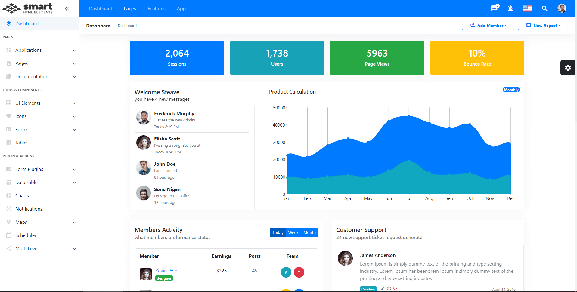
We are happy to announce the availability of our New Admin Dashboard Template: Bootstrap Admin Template. This template aims to demonstrate the usage of Smart UI along with Bootstrap. Smart UI now features a brand new Bootstrap Theme included in the download package. All Smart UI components natively integrate into Bootstrap-driven layouts. That means that now it is easier than ever to achieve web application adaptivity and consistent look across browsers and devices using jQWidgets products.
 Posted in: Angular, HTML Elements, Javascript, React Tagged: bootstrap, bootstrap admin template, bootstrap colors, bootstrap components, bootstrap controls, bootstrap dashboard, bootstrap design, bootstrap layout, bootstrap template, bootstrap theme, bootstrap ui, bootstrap ux, bootstrap4 Leave a comment Smart UI R1 2021 Release Is HereSmart UI Release is Here!The first release of 2021 of Smart UI is available, bringing many advanced features and updates across our Javascript & Blazor libraries 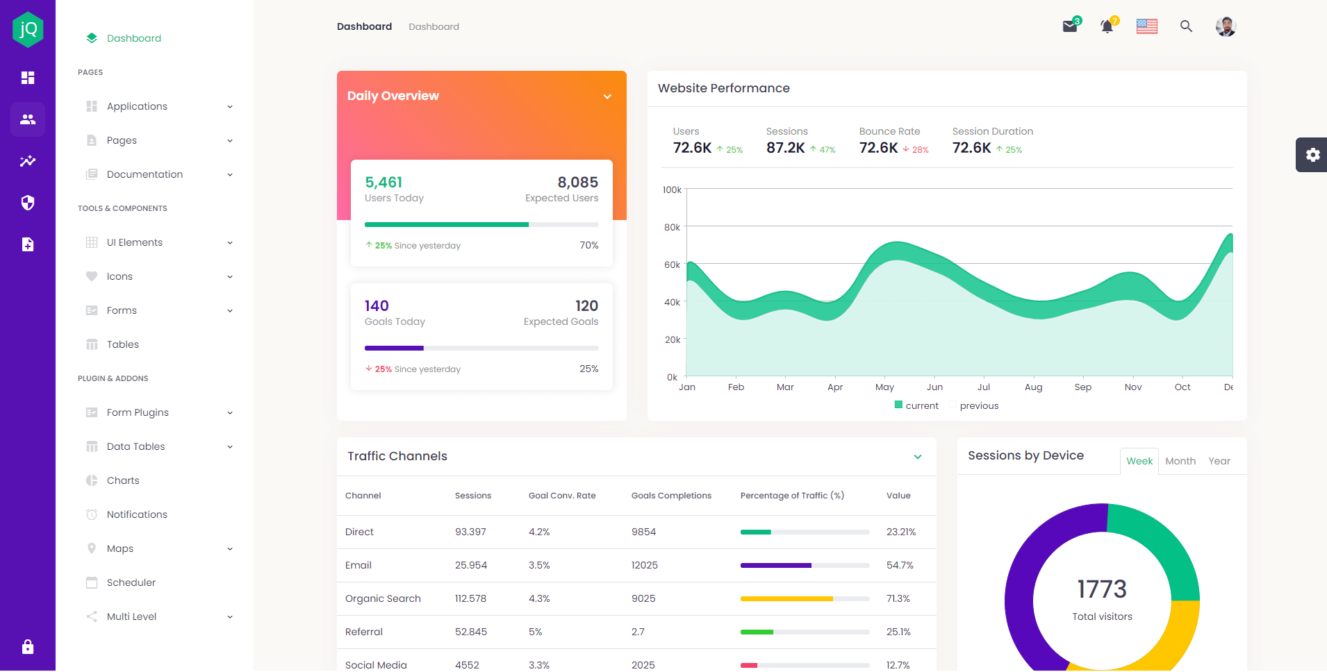
What's New:
Download Free Trial: https://www.htmlelements.com/download/ License: https://www.jqwidgets.com/license/ Happy coding, The jQWidgets & Smart UI Team Posted in: Angular, HTML Elements, Javascript, React, Smart Accordion, Smart Button, Smart Calendar, Smart ComboBox, Smart Context Menu, Smart Grid, Smart ListBox, Smart Tabs, Smart.Chart, Vue, Web Components Tagged: admin dashboard, admin template, bootstrap, bootstrap template, bootstrap5, dashboard template, templates, theme, themeforest, ui, uikit, uilibrary, ux Leave a comment Smart UI 9.0.0
We are happy to announce the new version of Smart UI. The major new thing in this release is the new feature-complete Scheduler component.
What's New:
Posted in: Angular, HTML Elements, Javascript, React, Smart Grid, Vue, Web Components Leave a comment Smart UI 8.1.1
We are happy to announce the new version of our software.
What's New:
You can get the new production build from: Download Blazor Component LibraryBlazor ComponentsWe are happy to announce Smart UI for Microsoft Blazor. Both server-side and client-side (WASM) Blazor are supported.What's Included:
Demos: Smart UI Blazor Demos Posted in: Uncategorized Tagged: blazor, blazor component library, blazor components, blazor grid, blazor kanban, blazor server side, blazor wasm, microsoft blazor 2 Comments Smart UI for Vue 3
Vue 3 is faster, smaller, more maintainable and it's easier to target native.
Composition APIOne of the most significant changes is that a new API that will allow for a function-based way of writing your component, inspired by React Hooks. It lets you encapsulate logic into "composition functions" and reuse that logic across componentOther changes in Vue 3 compared to Vue 2Virtual DOM rewrite for better performance and improved TypeScript support Native portals – now called Teleport Fragments (virtual elements that won't be rendered in the DOM tree) More flexibility for global mounting Conditional suspending of component rendering Smart UI for Vue 3Smart UI for Vue 3 is available at: https://www.htmlelements.com/vue/. All components are fully available and tested for Vue 3 web development. API & Getting Started Docs for Vue 3 have been added to https://www.htmlelements.com/docs/ Posted in: Smart Accordion, Smart Button, Smart Calendar, Smart ComboBox, Smart Context Menu, Smart Grid, Smart ListBox, Smart Tabs, Smart.Chart, Vue Tagged: vue 3, vue composition api, vuejs, vuejs 3 Leave a comment Smart UI v8.0.0Smart UI v8.0.0 Release, Sep-15-2020What's New:
Posted in: Angular, HTML Elements, Javascript, React, Web Components Tagged: pivot datagrid, pivot grid, pivot table Leave a comment Blazor Components coming soonBlazor UI ComponentsA week ago, we released our jQWidgets Blazor UI components: https://blazor.jqwidgets.com/. Now, we plan to do the same for our Smart product line. What is Blazor?Blazor is a new UI framework that was included in .NET Core 3. Blazor server-side and WebAssembly are both now shipping as part of .NET Core 3.2.0. Conceptually, Blazor is more like Angular or React rather than ASP.NET MVC. It’s a component-based framework for building rich and interactive web applications. The main difference between Blazor and traditional JavaScript frameworks is that Blazor components are written entirely in C# and Razor. No JavaScript required! Web apps are composed of reusable web UI components implemented using C#, HTML, and CSS. Both client and server code is written in C#, allowing you to share code and libraries. Blazor has two models: Server and WebAssembly. The server model was shipped with .NET Core 3. At that time, WebAssembly was still in preview, but has now been fully released with Blazor 3.2. Both are now production ready. Code running in the browser executes in the same security sandbox as JavaScript frameworks. Blazor code executing on the server has the flexibility to do anything you would normally do on the server, such as connecting directly to a database. What is WebAssemblyWebAssembly (abbreviated “Wasm”) is an instruction set designed to run on any host capable of interpreting those instructions, or compiling them to native machine code and executing them.Wasm is an instruction set that is formatted in a specific binary format. Any host (hardware or software) that adheres to this specification is therefore capable of reading binaries and executing them – either interpreted, or by compiling directly to machine language specific to the device. Wasm is akin to the common instruction set (Common Intermediate Language) that .NET source code compiles to. Just like .NET, Wasm can be generated from higher languages such as C#. Our new components will support both: Blazor WebAssembly hosting model and Blazor Server hosting model. Below is an image of a Smart.Button Blazor component. 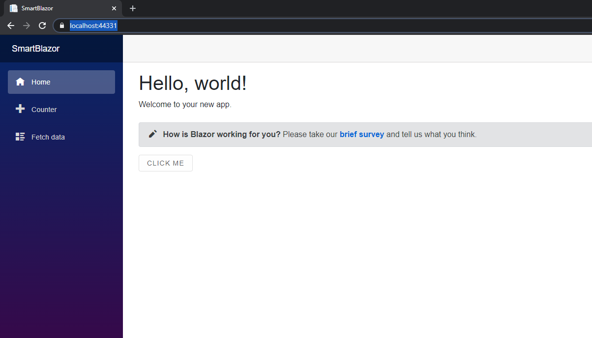
When is the first release of Smart UI for Blazor?Our plans are to release an early preview of Smart UI for Blazor by end of October and provide demos and documentation for most of the components, we currently have like DataGrid, Charting, Kanban, Table, CardView, etc. The installation would be through a NuGet package. Github repo for posting issues and feature request will also be available.For those of you who want to create Blazor applications with our components NOW, please refer to our help tutorial here: https://www.htmlelements.com/docs/blazor/ Update 07-July-2021Smart.Blazor NUGET package is available. All Blazor demos are available here: https://www.htmlelements.com/blazor/Posted in: HTML Elements, Web Components Tagged: .NET, blazor, C#, microsoft blazor, razor, web assembly Leave a comment Angular RxJS with DataGrid
Reactive programming is an asynchronous programming paradigm concerned with data streams and the propagation of change. RxJS (Reactive Extensions for JavaScript) is a library for reactive programming using observables that makes it easier to compose asynchronous or callback-based code. In this blog post we will show how to use our Angular DataGrid component with RxJS.

Observable creation functionsRxJS offers a number of functions that can be used to create new observables. These functions can simplify the process of creating observables from things such as events, timers, promises, and so on. For exampleUsing Smart.Grid with RxJS
In order to use our DataGrid with Angular and RxJS, you will need to do the following:
1. Create a new Angular project.
2. Install smart-webcomponents-angular vie npm install smart-webcomponents-angular or ng add smart-webcomponents-angular
3. Import the Smart.Grid module in app.module.ts
import { NgModule } from '@angular/core';
import { BrowserModule } from '@angular/platform-browser';
import { GridModule } from 'smart-webcomponents-angular/grid';
import { AppComponent } from './app.component';
import { FormsModule } from '@angular/forms';
import { HttpClientModule } from '@angular/common/http';
@NgModule({
    declarations: [ AppComponent ],
    imports: [ BrowserModule, FormsModule, GridModule, HttpClientModule ],
    bootstrap: [ AppComponent ],
	entryComponents: [ AppComponent ]
})
export class AppModule { }
4. Edit app.component.ts
import { Component, ViewChild, AfterViewInit, ViewEncapsulation } from '@angular/core';
import { GridComponent, GridColumn, DataAdapter, Smart } from 'smart-webcomponents-angular/grid';
import { GetData } from './data'
import { Observable, from  } from 'rxjs';
@Component({
    selector: 'app-root',
    templateUrl: './app.component.html',
    styleUrls: ['app.component.css'],
    encapsulation: ViewEncapsulation.None
})
export class AppComponent implements AfterViewInit {
	@ViewChild("grid", { read: GridComponent, static: false }) grid: GridComponent;
    // setup Datagrid's price column template.
    changeTemplate(formatObject: any) {
        const value: number = formatObject.value, opacity: number = Math.abs(value) / 100;
        if (value < 0) {
            formatObject.cell.background = `rgba(229, 57, 53, ${opacity})`;
        }
        else if (value > 0) {
            formatObject.cell.background = `rgba(67, 160, 71, ${opacity})`;
        }
        formatObject.template = value + '%';
    }
	// setup Datagrid appearance.
	appearance = {
        alternationCount: 2,
        showColumnLines: false,
        showColumnHeaderLines: false
    };
	// setup Datagrid columns resize.
    behavior = { columnResizeMode: 'growAndShrink' };
    // setup Datagrid data source.
    dataSource = new window.Smart.DataAdapter({
        dataSource: [],
        dataFields: [
            'commodity: string',
            'price: number',
            'priceChange: number',
            'day: number',
            'week: number',
            'month: number',
            'year: number',
            'date: date'
        ]
    });
	// setup Datagrid columns.
    columns = [
        { label: 'Commodity', dataField: 'commodity' },
        {
            label: 'Price', dataField: 'price', align: 'left', cellsAlign: 'left', template: function (formatObject: any) {
                const value: number = formatObject.value.toFixed(2);
				const priceChange: number = (this as any).grid.dataSource[formatObject.row.index].priceChange;
  			    if (priceChange === 0) {
                    formatObject.template = value;
                }
                else {
                    formatObject.template = `
${priceChange}
${value}`;
                }
            }
        },
        { label: 'Weekly', dataField: 'week', template: this.changeTemplate },
        { label: 'Monthly', dataField: 'month', template: this.changeTemplate },
        { label: 'Yearly', dataField: 'year', template: this.changeTemplate }
    ];
    ngAfterViewInit(): void {
		const that = this;
		// init demo server.
		const demoServer = this.setupDemoServer(),
		initServer = demoServer.init(),
		serverData = demoServer.getData();
	  	initServer.subscribe(function(dataRows) {
		that.dataSource = new window.Smart.DataAdapter({
				dataSource: dataRows.slice(0),
				dataFields: [
					'commodity: string',
					'price: number',
					'priceChange: number',
					'day: number',
					'week: number',
					'month: number',
					'year: number',
					'date: date'
				]
			});
		serverData.subscribe(function(rows) {
				// suspend updates.
				that.grid.beginUpdate();
				// update cell values.
				for(let i = 0; i < that.grid.rows.length; i++) {
					const row = that.grid.rows[i];
					const priceCell = row.getCell('price');
					const priceCellChange = row.getCell('priceChange');
					row.data.priceChange = rows[i].priceChange;
					row.data.price = rows[i].price;
				}
				// resume updates.
				that.grid.endUpdate();
		  });
		});
    }
	// setup demo server.
	setupDemoServer() {
	  function demoServer() {
		'use strict';
		this.dataRows = [];
	  }
	  // init server and fetch data from url.
	  demoServer.prototype.init = function() {
		return from(
		  new Promise((resolve, reject) => {
			  fetch('https://raw.githubusercontent.com/HTMLElements/smart-webcomponents-angular/master/data.json')
			  .then(response => response.json())
			  .then(data => {
					let dataSet = data;
					this.dataRows = dataSet.map((value) => {
						const newData = Object.assign(value);
						newData.priceChange = 0;
						return newData;
					});
					resolve(this.dataRows);
			  });
		  })
		);
	  };
      // get data and update it every 1s using Observable.
	  demoServer.prototype.getData = function() {
		const that = Object(this);
		// dynamic updates.
		return Observable.create(function(observer) {
		  const interval = setInterval(() =>{
			for (let i = 0; i < that.dataRows.length; i++) {
			    const index = Math.floor(that.dataRows.length * Math.random());
				const currentdataRows = that.dataRows[index];
				let value = currentdataRows.price;
				if (Math.random() > 3 / 5) {
					value = value + 1e-10;
					currentdataRows.priceChange = 0;
					continue;
				}
				let valueChange = (Math.random() > 0.5 ? 1 : -1) * value * ((Math.random() * 15 + 1) / 100);
				valueChange = parseFloat(valueChange.toFixed(2));
				value = Math.max(1, parseFloat((value + valueChange).toFixed(2)));
				currentdataRows.price = value;
				currentdataRows.priceChange = valueChange;
			}
			observer.next(that.dataRows);
		  }, 1000);
		  return function() {
			window.clearInterval(interval);
		  };
		});
	  };
	  return new demoServer();
	}
}
Full tutorial: https://www.htmlelements.com/docs/angular-rxjs/ DataGrid Validation Coming soonDataGrid Data ValidationThe next version will include a much requested feature - Data Validation for the DataGrid component. The DataGrid control will allow you to perform validation at both the cell and row level. With cell-level validation, you validate individual properties of a bound data object when a user updates a value. With row-level validation, you validate entire data objects when a user commits changes to a row. You can also provide customized visual feedback for validation errors, or use the default visual feedback that the DataGrid control provides. The available set of validation rules are: 'min', 'max', 'minLength', 'maxLength', 'minDate', 'maxDate', 'null', 'email', 'required', 'requiredTrue' and 'pattern'. 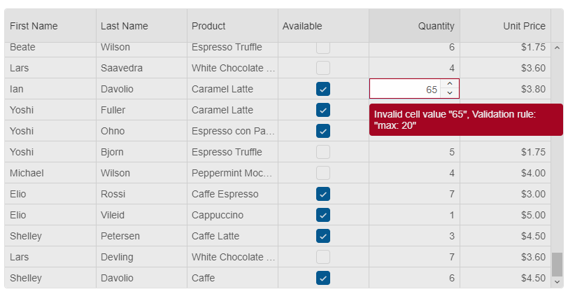
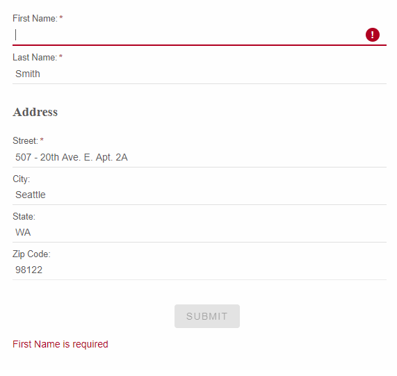
Shadow DOM Support with Smart UI 7.7.1What is Shadow DOM?The shadow DOM is an encapsulated version of the DOM. This allows authors to effectively isolate DOM fragments from one another, including anything that could be used as a CSS selector and the styles associated with them. Generally, any content inside of the document’s scope is referred to as the light DOM, and anything inside a shadow root is referred to as the shadow DOM. How to use Shadow DOM with Smart Web Components?The new version(7.7.1) of our library adds complete Shadow DOM support for all web components. To use the components with Shadow Dom enabled, you need to refer the "source/components" folder. When you use these components, you no longer have to add a reference to the "smart.default.css" file as all required styles by the component are included in its file. Example: https://www.htmlelements.com/demos/grid/shadow-dom/ We added some useful API for importing Styles into the Shadow DOM. Each Web component has a new "addStyle" method which accepts a CSS string. There is also a "style-url" attribute. When you set that attribute during initialization time, the referred CSS file will be included into the Shadow DOM of your component. Why should I use Shadow DOM?Benefits of using Shadow DOM are CSS scoping, DOM encapsulation and composition. The web components will be isolated by the other parts of your application and there will be no CSS conflicts.Posted in: Uncategorized Tagged: css variables, light dom, shadow document, shadow dom, shadow root, shadow styles, web components Leave a comment Reactive Form Web ComponentReactive FormA new Reactive Form will arrive in Smart UI 7.7.0. It will have two types of initialization. Reactive forms use an explicit and immutable approach to managing the state of a form at a given point in time. Each change to the form state returns a new state, which maintains the integrity of the model between changes. Reactive forms are built around observable streams, where form inputs and values are provided as streams of input values, which can be accessed synchronously. Reactive forms also provide a straightforward path to testing because you are assured that your data is consistent and predictable when requested. Any consumers of the streams have access to manipulate that data safely. The purpose of our new Form component is to provide you an awesome and modern looking Form component, which is easy customizable and will help you to deliver better and professional looking web Forms.Create a Form from HTML TemplateIt will be possible to create a new Smart.Form from an existing HTML Form component and will add validation, AJAX submit, control states such as: 'dirty', 'touched', 'pristine', 'valid', 'invalid'.Example:
  const form = new Smart.Form('#profileForm', {
        firstName: ['', {
            validationRules: [
               { type: 'required', message: 'First Name is required' },
               { type: 'stringLength', min: 2, message: 'First Name requires minimum 2 characters' }
            ]
        }],
        lastName: ['', {
          validationRules: [{ type: 'required', message: 'Last Name is required' }]
        }
        ],
        address: new Smart.FormGroup({
          street: ['', {
            validationRules: [
                { type: 'required', message: 'Street is required' }
            ]
          }
          ],
          city: [''],
          state: [''],
          zip: ['']
        })
      });
Create a Form from JSONThe Form will be created dynamically from JSON object where we specify each Form Control and Form Group. Example:
 const form = new Smart.Form('#profileForm', {
			controls: [{
				controlType: 'group',
				columns: 2,
				label: 'Employee',
				dataField: 'employee',
				labelPosition: 'left',
				controls: [
					{
						label: 'Photo',
						template: '<div style=" overflow: hidden;"><img width="125" src="../../images/people/andrew.png"/></div>',
						controlType: 'template'
					},
					{
						label: 'Name',
						dataField: 'name',
						controlType: 'group',
						controls: [
							{
								dataField: 'firstName',
								controlType: 'input',
								label: 'First name',
								required: true,
								info: 'Enter first name',
								placeholder: 'First name',
								cssClass: 'outlined',
								infoPosition: 'right'
							},
							{
								dataField: 'lastName',
								controlType: 'input',
								label: 'Last name',
								placeholder: 'Last name',
								required: true,
								cssClass: 'outlined',
								info: 'Enter last name'
							}
						]
					},
					{
						label: 'Details',
						dataField: 'details',
						controlType: 'group',
						columnSpan: 2,
						controls: [
							{
								dataField: 'company',
								controlType: 'input',
								label: 'Company',
								placeholder: 'Company name',
								cssClass: 'outlined',
								required: false
							},
							{
								dataField: 'address',
								controlType: 'input',
								label: 'Address',
								placeholder: 'Address',
								required: true,
								cssClass: 'outlined'
							},
							{
								dataField: 'city',
								controlType: 'input',
								label: 'City',
								placeholder: 'City',
								cssClass: 'outlined',
								required: true
							},
							{
								dataField: 'state',
								controlType: 'dropdownlist',
								label: 'State',
								required: true,
								cssClass: 'outlined',
								controlOptions: {
									placeholder: 'State',
									dataSource: ['California', 'New York', 'Oregon', 'Illinois', 'Texas']
								}
							},
							{
								dataField: 'zip',
								controlType: 'input',
								placeholder: 'Zip',
								cssClass: 'outlined',
								label: 'Zip code',
								required: true
							}
						]
					}
				]
			},
			{
				controlType: 'group',
				columns: 2,
				controls: [
					{
						controlType: 'button',
						action: 'submit',
						label: 'Sign up',
						cssClass: 'success',
						align: 'right'
					},
					{
						controlType: 'button',
						action: 'reset',
						label: 'Cancel',
						align: 'left'
					}
				]
			}
		]}
    );
The output of the above code is: 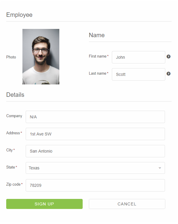
Posted in: Angular, HTML Elements, Javascript, React, Web Components Tagged: form, forms, reactive form, reactive form web component, reactive forms, reactive ui form Leave a comment New React UI Components, Awesome Grid Updates and more
The newest release of Smart came out. It brings a new toolkit built for React JS and available through NPM installation. The new version also extends the Grouping and Filtering functionality of the DataGrid control and adds 4 new Input Components.
What's New:
DataGrid Grouping Panel, Row and Column Reorder
The next release of Smart will include awesome new DataGrid features - Group Panel, Row and Column Reorder.
Grouping DataGrid data with Grouping panelData in DataGrid can be grouped by one column or by several. When a column is used for grouping, it is added to the group panel. By default, the group panel is hidden. To make it visible, we added a boolean property. With the grouping panel, you can drag a column header to group by it and you can also sort by that column by clicking on it. To remove the DataGrid grouping, all you need to do is to drag a column from the grouping panel and drop it into the Grid. 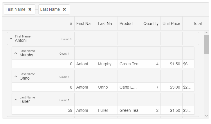
DataGrid Row ReorderRow Reorder feature adds the ability for rows in a DataGrid to be reordered through user interaction with the table (click and drag / touch and drag). This feature will be turned on by using a boolean property, called "allowRowReorder". Each row will have a property called "allowReorder" which will allow you to disable the feature for a specific datagrid row.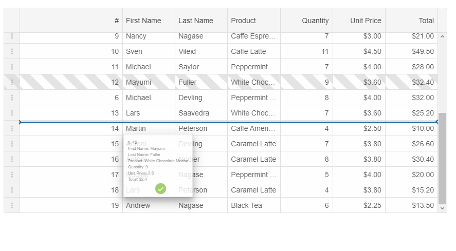
DataGrid Column ReorderColumn Reorder feature adds the ability for columns in a DataGrid to be reordered through user interaction with the table (click and drag / touch and drag). This feature will be turned on by using a boolean property, called "allowColumnReorder". Each column will have a property called "allowReorder" which will allow you to disable the feature for a specific datagrid column.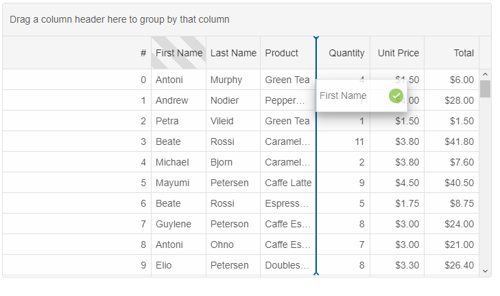
Posted in: Uncategorized Tagged: datagrid, datagrid angular, datagrid reactjs, datagrid vuejs, datagrid vuew, datagrid web component Leave a comment |
|
